TL;DR: Your gym website should do more than look good — it should turn visitors into leads. This guide covers the essential components of effective gym website design, 20 real-world examples, and proven strategies for building a site that converts.
As a fitness business, learning how to create a gym website that is designed and optimized to generate leads isn’t an easy task, but it can be a major win for your business.
You’re probably already investing in ads and social media to drive traffic. If your gym website design isn’t built to convert visitors into leads, however, then that hard-won traffic is going to waste.
Your gym website is a crucial marketing tool and a key part of your success. But having a gym website is one thing. Having an effective site that makes you stand out from competitors and drives potential members to take action is another.
In this article, we’ll cover the essential components of a great gym website, share some real-world examples to inspire you, and show you how to turn your site into a lead generation machine that converts visitors into paying members. Let’s get started!
View this post on Instagram
Why You Need a Gym Website For Your Business

If you run a a fitness business, you need a great gym website, period. First and foremost, having one helps people find your business online. Second, considering that all your competitors likely already have a website, you’re behind the curve if you don’t have one.
However, it’s not enough to just have a website. It needs to be a great website to establish your business as an authority, help manage your members, and so much more. Here are 5 reasons you need a great gym website:
1. It contributes to a strong online presence
Think of your own life: imagine someone mentioning a great gym to you – what’s the first thing you do? You Google it, of course.
You need a strong online presence so that potential members can find you. 81% of people search online for a product or service. Part of a strong online presence is a fully mobile- and conversion-optimized website. Make it as easy as possible for prospective members to find you.
2. Having a gym website increases credibility and revenue
A good website makes you look credible and trustworthy, full stop. It shows that you’re qualified, professional, and ready to engage with your membership base. Your expertise is evident, and this helps to build your authority.
At the same time, a website can be a significant driver in increasing revenue – it’s a tool for actively capturing leads. A well-designed gym website is more likely to convert visitors into paying members. For example, a quick Google search for a home fitness streaming platform may land potential customers on your website. If it’s straightforward and easy to navigate, they can sign up quickly and immediately start using your services.
Don’t have a website that allows your members to immediately sign up to your business?
3. Your members (current and prospective) expect a gym website
Prospective members expect you to have a website, full stop. Your website affects how people perceive the quality and credibility of your services. It takes about 50 milliseconds for users to form an opinion of your website. That’s how long it takes for them to decide whether they stick around or go elsewhere.
If you have a poorly designed website on mobile, 57% of users wouldn’t recommend your business. The customer expectation is to not only have a website, but to have a responsive and compelling website with an easy to navigate layout and design.
4. Having a website helps you win online search results
Your website can help you attract new customers through search results. An SEO-optimized website can help you rank for several terms on Google and attract a steady flow of potential customers.
Plus, with AI tools changing how people search for information online, having a properly optimized website increases your chances of showing up in AI-generated answers.
While there are plenty of factors involved with ranking in search results, simply having a website opens you up to more opportunities. When you incorporate search engine optimization and answer engine optimization into your website, you can attract more traffic, rank higher, and ultimately convert more leads into paying members.
📝 Read More: Local Gym SEO: How to Dominate Your Area
5. It provides a better member experience
The member experience involves every aspect of your business. It includes your interactions with staff members, the quality of your facilities, your gym management software, and more.
With more fitness businesses than ever operating under a hybrid model, the digital experience your gym provides is just as important as the experience your members have in-person.
A great website promotes a great member experience. Maybe your website houses your class schedule and member portal. Something as simple as easy booking and automated class reminders adds to the overall experience and leaves members feeling good about your brand.
Not sure how to keep your members engaged and inspired?
Download our free eBook on Member Engagement.
The Customer
Engagement Playbook
for Your Fitness
Business
Discover more
What Goes Into Creating an Effective Gym Website?
Transforming your gym website into a lead-generation machine that converts prospects into paying members is a process. The best gym websites serve the larger business in multiple ways. Your website attracts new members, helps you manage class bookings, and nurtures a sense of community. Here are the 12 key components of effective gym website content:
1. Location and contact information
Your website needs to include current business information, whether you’re an online-only digital fitness platform or have multiple gym locations across the country. Visitors to your website don’t want to have to dig or scroll to find important information, like your location or operating hours. Make it as easy as possible to find the information people need.
Essential business information includes:
- Location
- Phone number and email address
- Hours of operation
- Business description
- FAQs (which are also great for SEO/AEO!)
2. Reviews and testimonials
Research shows that 49% consumers trust reviews just as much as a personal recommendation. On top of this, 85% of consumers say that an positive online review influences their purchase decision.
When a potential member is thinking of signing up for your services, they want to know if it’ll be the right fit them. Maybe they want to find out what your gym community is like or how effective your body workout classes are. Besides asking friends and family, they’ll consult reviews on your Google Business Profile and testimonials you have on your website. This is powerful social proof that needs to be prominently displayed throughout your website.
3. Mobile-friendly and easy to navigate
A poor gym website will deter visitors. And, unfortunately, one poor experience means they’re unlikely to return.
A well-designed website, on the other hand, has an intuitive user experience (UX). This means that the user should understand how to navigate your website without having to think too hard about it. A responsive design is part of the user experience; this means that your website should be mobile-friendly and automatically adjust to the user’s device.
Features to consider include:
- Social media integration
- Easy-to-use navigation
- Search bar
- One-button payments
- Prominent CTAs throughout
- Accessibility features
4. Member management portal
Flexibility, efficiency, and convenience are key to member satisfaction in a world of digital-first experiences.
A member management portal adds another level of functionality to your gym website. For instance, a member portal allows your members to manage their own membership, update payment details, and view their bookings — without having to call or email anyone. Your members get a sense of control and ownership over the membership, and in turn there’s less of an administrative burden on your gym.
A member portal also helps to reduce no-shows as members can cancel bookings online and are sent automated class reminders to stay on track.
📝 Check Out: How to Reduce No-Show Appointments in Your Fitness Studio
5. Fitness class schedule and bookings
Your gym website content is where members will find out what services you offer, view your fitness class schedule, and book their initial trial.
One example of the best gym websites is F45 Training. It has a clean and minimalist design with engaging visuals and punchy messaging. As soon as you land on the site, there are multiple clear options to “Book a Trial” (also known as a call-to-action, or CTA). Just as prominent is the option to find an F45 studio near you, or to learn more about the F45 experience.
Plus, the descriptions of workout types tell visitors exactly what to expect, and the site navigation is easy to use. We’ll take a closer look at F45’s website later in this article.
6. Live streaming and on-demand classes
Hybrid fitness is now the baseline for most fitness experiences. Members today move easily between in-person classes and digital workouts, and your website should reflect that. A well-designed gym website makes it easy for visitors to discover and access your digital offerings alongside your in-person schedule.
If you offer live streaming or on-demand classes, lead with them. A prominent “Start free trial” button or a dedicated section for your digital platform gives new visitors an immediate on-ramp.
Fitness apps and on-demand libraries have become a standard part of the member experience, and studios that surface these options clearly on their website give prospective members one more reason to commit.
7. High-quality visuals and fresh content
Your gym website content is just as important as the look and feel of your site. You need high-quality visuals and fresh content to stay relevant. For instance, regularly publishing helpful content about your offerings will increase your chances of showing up in Google or AI search results.
Other types of gym website content to consider include:
- Video
- Podcast
- High-resolution images
- Clear graphics
- Engaging animations
📝 Check Out: The Top Fitness Blogs to Follow in 2026
8. E-commerce functionality
If you sell branded merchandise and products, it’s a good idea to include an e-commerce component to your website. Make it as easy as possible for visitors to find and pay for products. For example, if you run a yoga studio, you may stock yoga mats, branded water bottles, yoga towels, and other products that students might forget when coming to class.
The main thing is that website visitors should be able to easily find and pay for any products. Plus, selling branded merchandise helps to create additional revenue streams for your gym.
9. Content that’s probably optimized for search engines and AI
All pages on your gym website should be fully search-engine optimized. Proper optimization not only helps you to appear higher on search engines, but it also helps to improve the overall user experience. Adding genuine and relevant content improves your SEO score, as does optimizing for mobile and increasing your website’s speed.
One of the most biggest benefits of SEO is that it helps you to target quality traffic. When your website or blog gets shown to someone who is actively searching for the service your gym offers, it builds trust and increases the chances of generating a high-quality lead.
It’s also worth thinking beyond traditional search. Answer Engine Optimization (AEO) helps your gym website content show up in AI-generated answers and voice search results. Structuring your content to directly answer common questions is increasingly how fitness businesses get discovered.
10. Eye-catching and professional web design
A professional gym website design can have a massive impact on the overall quality of your website. A beautiful design showcases your fitness brand, encourages visitors stick around, builds trust, and can ultimately help convert them into paying members. Never underestimate the power of a great website. When you’re making a first impression, your website’s feel can attract or deter potential members.
Staying up to date on web design principles is crucial to a great-looking gym website. The leading design priorities in 2026 look quite different from a few years ago — the focus has shifted toward performance, accessibility, and authenticity:
- Mobile-first layout
- Fast load times (aim for under 3 seconds)
- Clean, minimal navigation
- Authentic photography featuring real members and real spaces
- High contrast for readability and accessibility
- Consistent brand colors and typography across every page
11. Good security, hosting, and privacy features
To convert visitors into paying members, your website needs to ensure the safety of your users. Privacy and security are hot topics, and you need to make sure you look after your customer data.
If you have a booking function and member portal on the site, you’ll likely be storing payment details and other sensitive data. In the world of online payments, e-commerce fraud is becoming increasingly common. You’ll need to have a secure website that protects all member data and payment details.
12. Clear calls-to-action (CTAs)
Now that we’ve covered some of your gym website’s most important elements, don’t forget to include clear calls to action! These are small buttons that you want website visitors to click, and they’re crucial for guiding prospective members through your gym sales funnel. Most gyms have “Start a Free Trial” or “Get Started Today” as primary CTAs. Both the website design and copywriting play a role in creating compelling calls to action that encouage visitors to take action on each page.
📝 Check Out: Gym Landing Page: Build One That Converts Free Trials

20 Examples of The Best Gym Websites in 2026
Not sure where to start with how to create gym website? Here are examples of some of the best gym websites to inspire you!
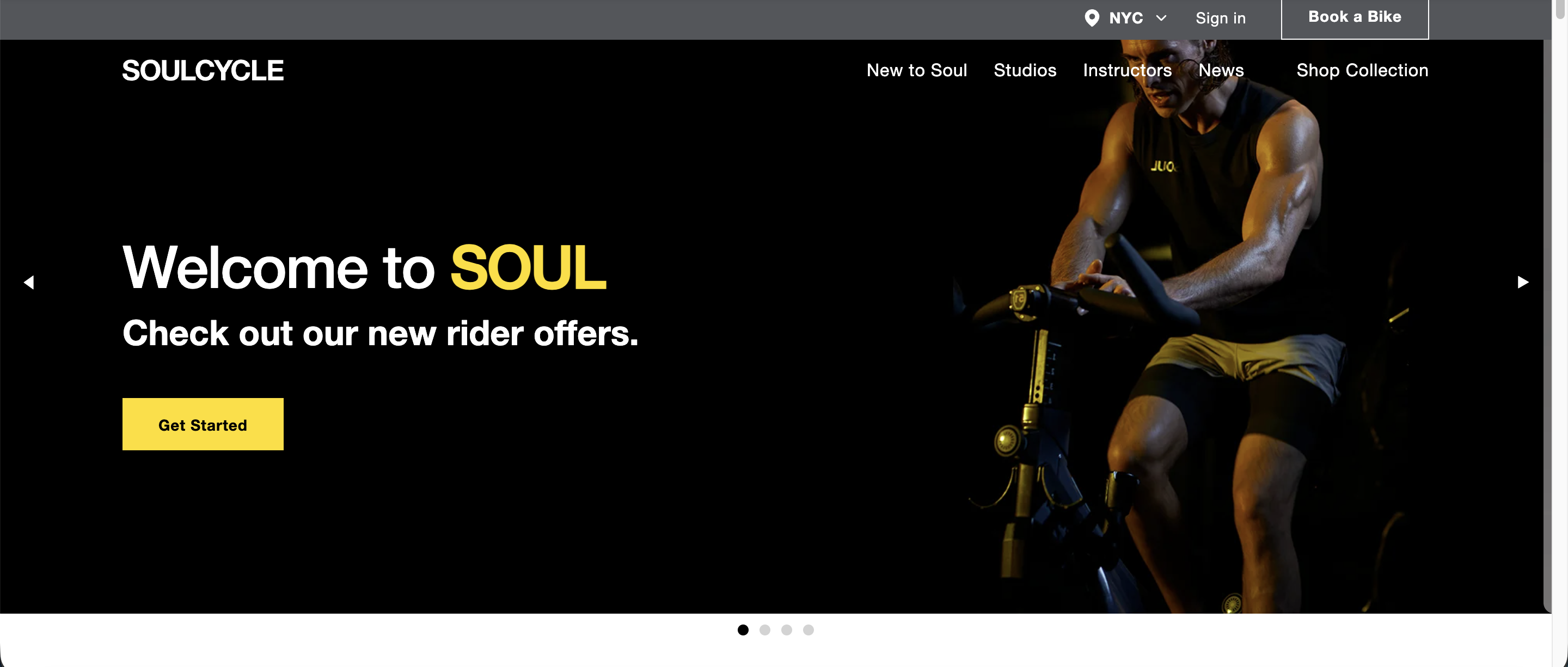
1. Soul Cycle
One of the most iconic boutique fitness brands in America, SoulCycle built its reputation on rhythm-based riding, legendary instructors, and a fiercely loyal community. The website reflects that identity clearly. T
he homepage leads with a full-bleed hero image and a prominent “Book a Bike” CTA in the top navigation — always visible, no matter where you scroll. A “New to Soul?” onboarding section answers common questions before hesitation sets in. It’s a strong example of a gym website that serves both new and returning members without cluttering the experience.
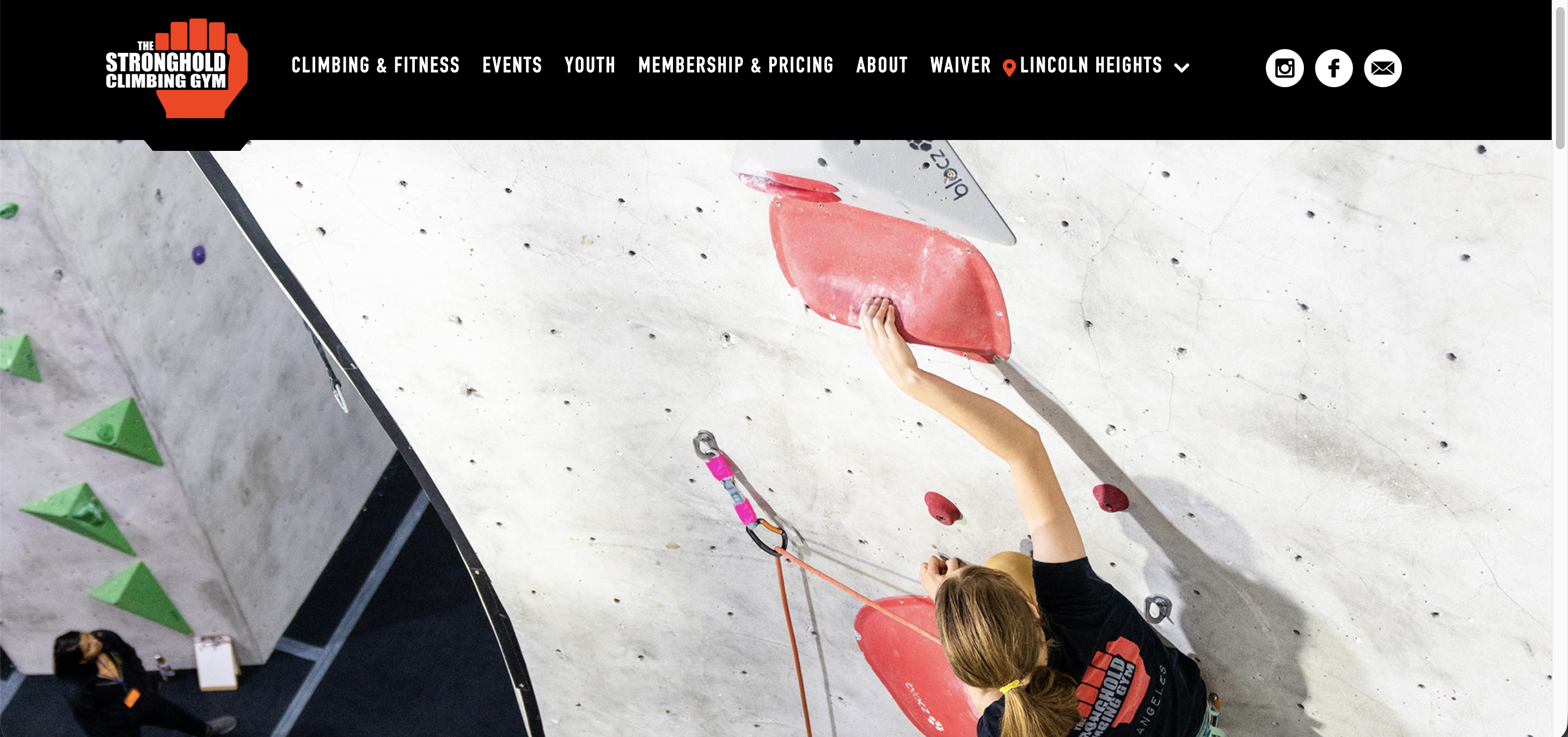
2. The Stronghold Climbing Gym
Based in Los Angeles, The Stronghold is one of America’s favourite climbing gyms, with two locations offering everything from bouldering and roped climbing to yoga, fitness classes, and strength training.
The website does a great job of making key information immediately accessible — both locations’ addresses, phone numbers, and hours are clearly displayed, which builds instant credibility with prospective members. Pricing, classes, and first-timer guides are easy to find, reducing the friction that often stops new visitors from taking the next step.
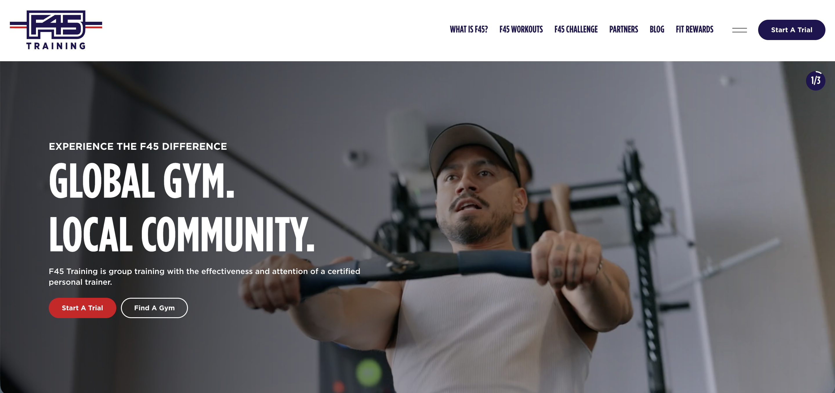
3. F45 Training
Born in Australia in 2012, F45 Training has grown into one of the world’s largest functional fitness franchises, with studios across dozens of countries.
The 45-minute format — combining HIIT, circuit, and functional training — is front and center on the homepage, backed by a full-screen video hero that immediately communicates the energy of a class. CTAs are persistent and clear throughout: “Start Your Trial” and “Find a Studio” appear in the top navigation and repeat down the page, so prospective members are never more than one click from converting.
Member testimonials are prominently featured, giving social proof real estate alongside the workout content.
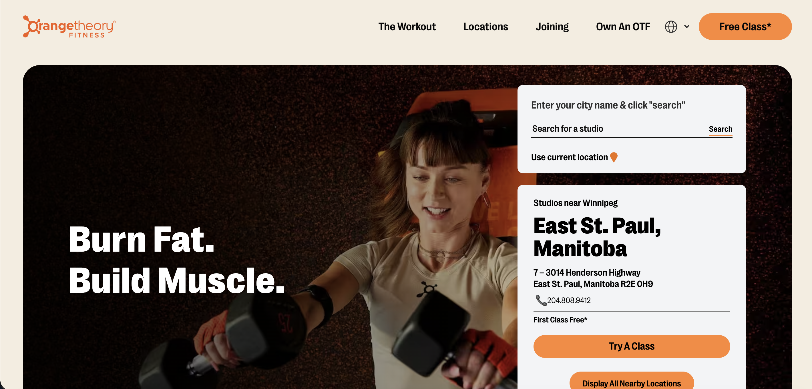
4. Orangetheory Fitness
Orangetheory built its brand around heart rate-based training, and the website leads with exactly that. The homepage opens with outcome-led messaging — fat loss percentages, lean muscle gains, and a 30-day money-back guarantee — all above the fold, giving prospective members a clear reason to act before they’ve scrolled once.
A persistent “Free Class” CTA in the top navigation removes the biggest barrier to entry immediately. Member testimonials with specific results appear mid-page alongside the OTconnect™ technology that powers the in-class experience, reinforcing both social proof and the brand’s science-backed identity in one section.
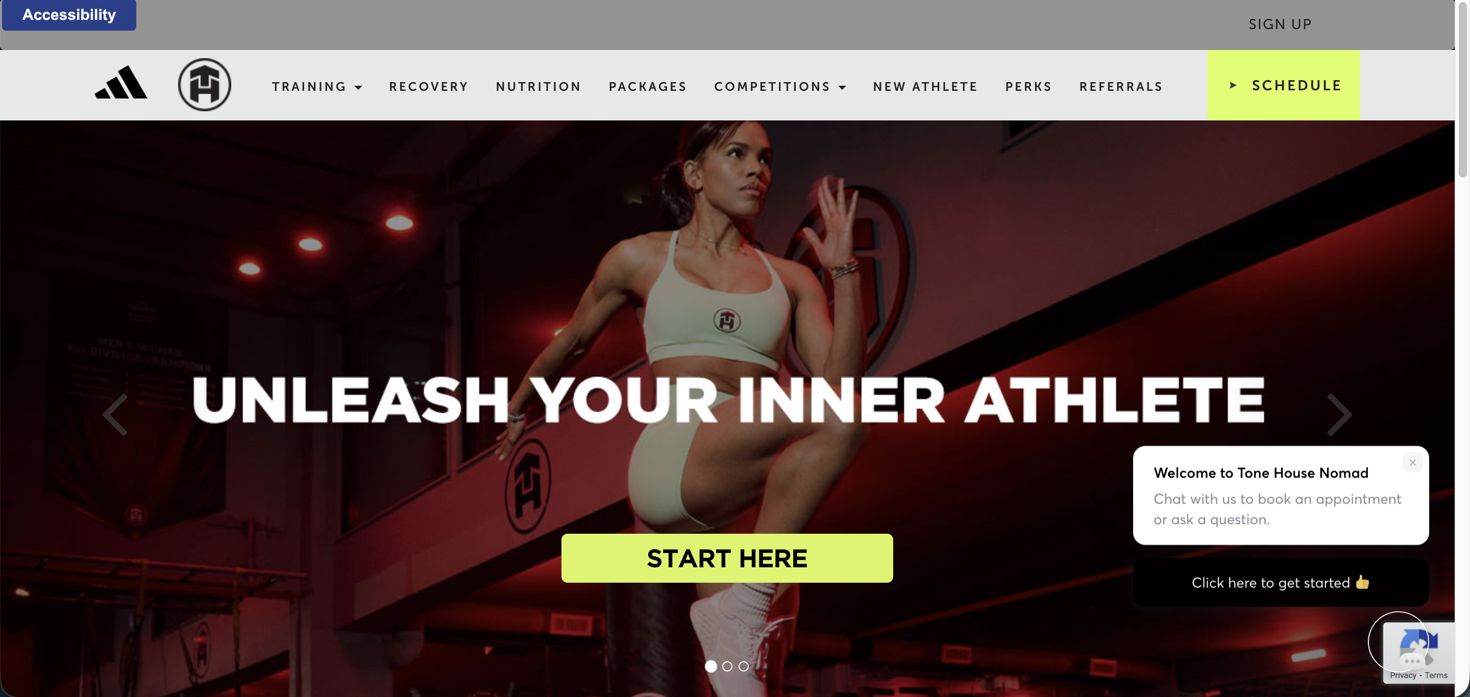
5. Tone House
Founded by former NFL athlete Alonzo Wilson, Tone House is New York City’s premier strength and conditioning facility, built around athletic training rather than traditional gym classes.
The website leads with a schedule CTA in the top navigation, keeping booking front and center for returning members. Press logos from ABC News, Bloomberg, and Women’s Health are prominently displayed, lending immediate credibility to first-time visitors. An active Instagram feed and a visible competitions calendar — including signature events like Turf Wars — signal a community that extends well beyond the gym floor.
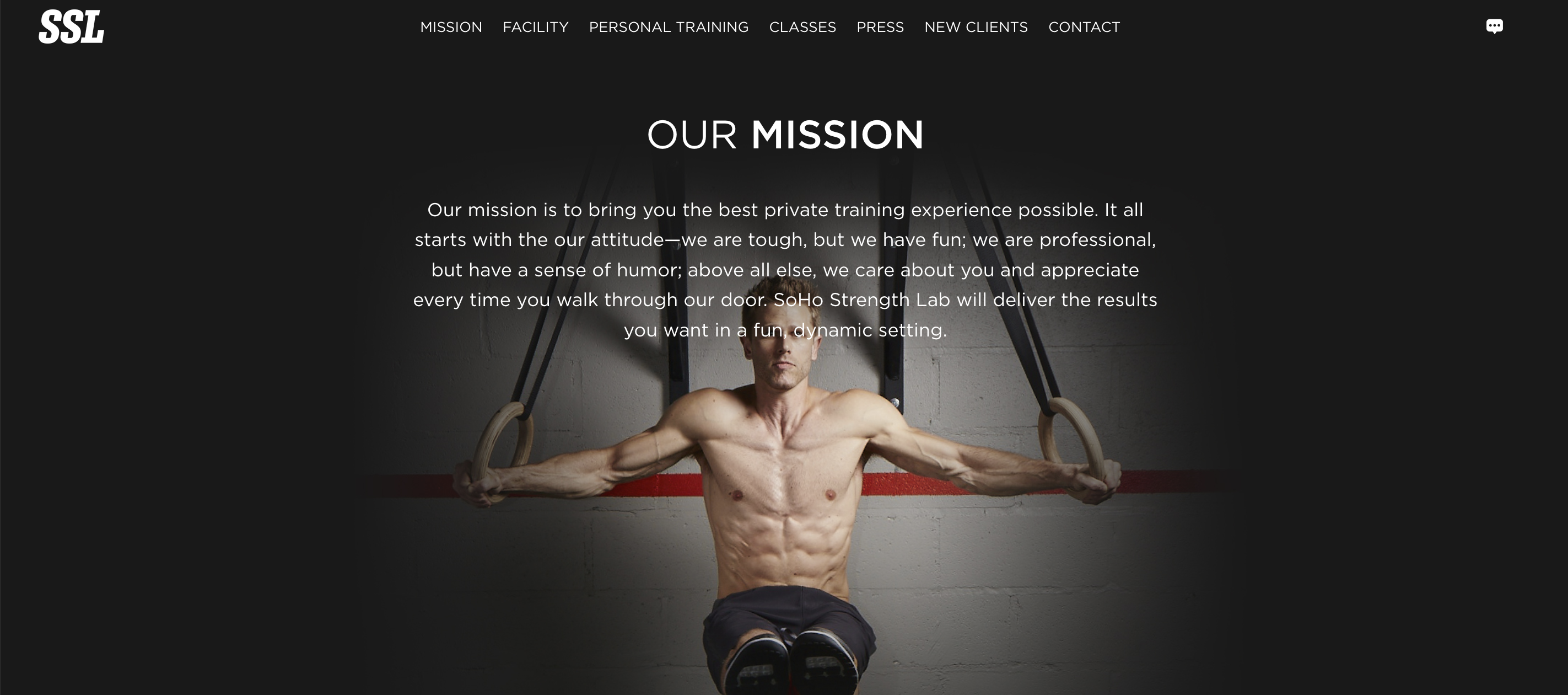
6. SoHo Strength Lab
Manhattan’s SoHo Strength Lab is a private training facility built around personal training and small group classes. The dark, minimal design signals a serious training environment, and the facility section earns its place — real photos of the two-floor space give prospective members a clear picture of what they’re walking into.
Navigation is straightforward, with dedicated sections for Personal Training, Classes, and New Clients.
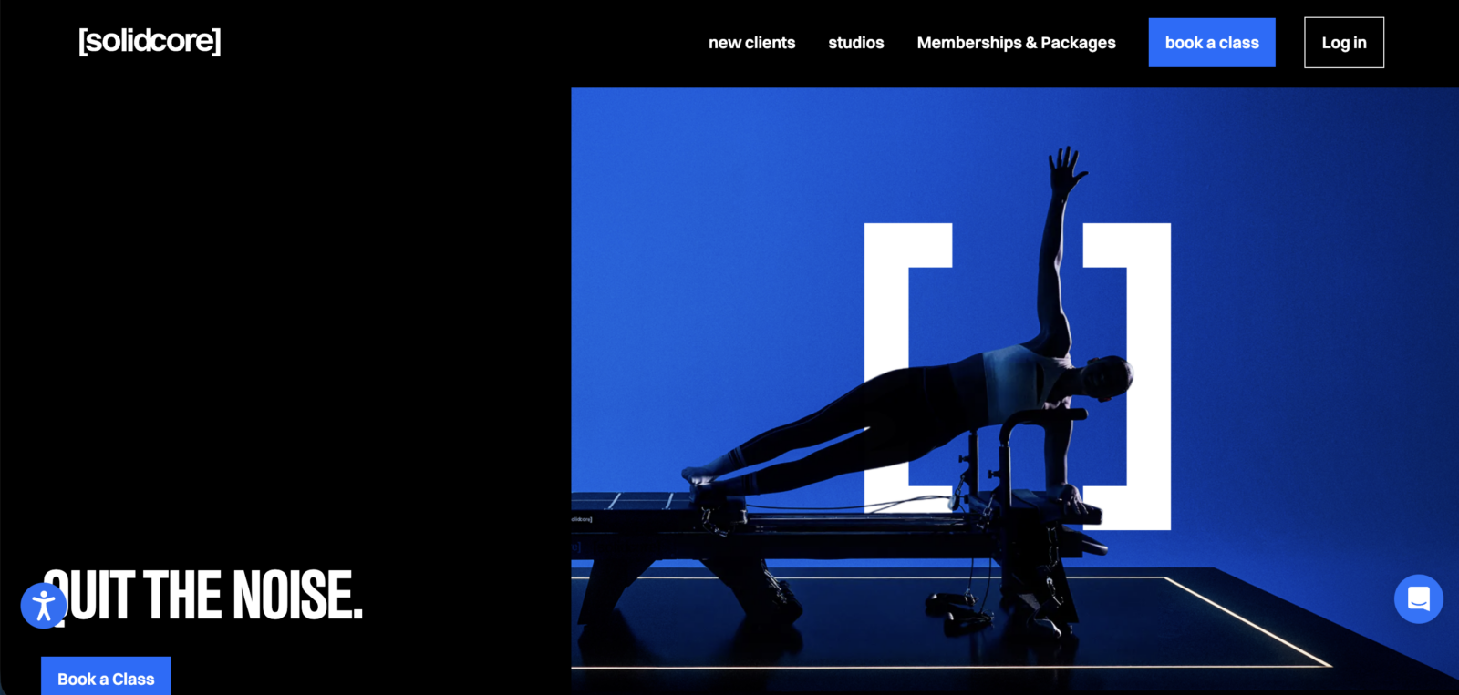
7. Solid Core
[solidcore] has grown into one of America’s leading reformer Pilates studios, with locations across the country.
The website makes a strong first impression — a bold black and blue design with high-impact photography and a headline (“QUIT THE NOISE.”) that speaks directly to the brand’s no-nonsense identity. “Book a Class” appears twice above the fold: as a high-contrast blue button in the top navigation and again as a CTA below the hero headline, so prospective members have an immediate action to take from the moment they land on the page.
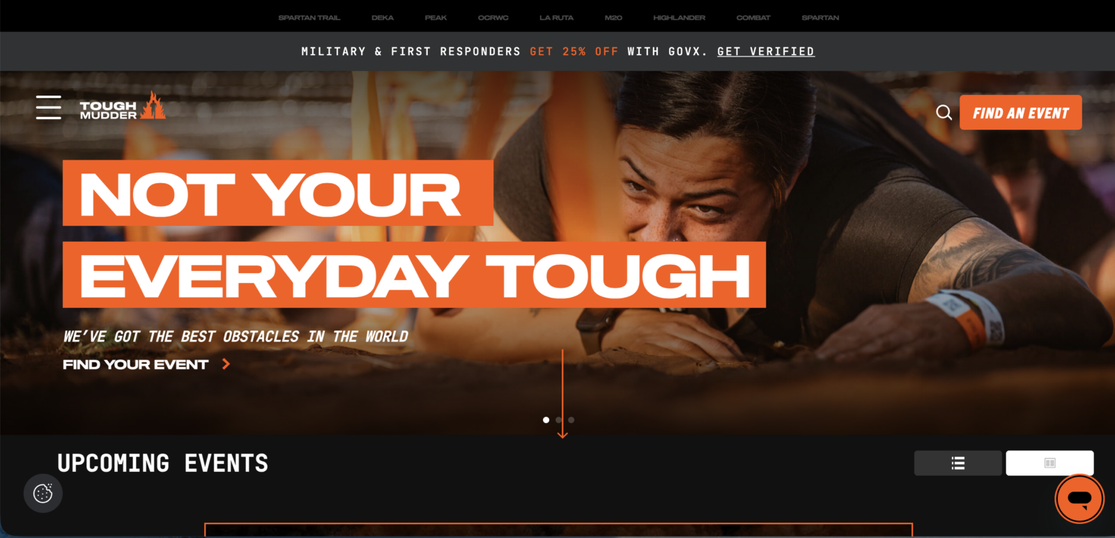
8. Tough Mudder
Founded in 2010, Tough Mudder has evolved from a boot camp gym concept into one of the world’s most recognized obstacle course event series, with events across the US and internationally.
The website reflects this shift — it’s built around event registration, with a persistent “Find An Event” CTA anchoring the homepage and a full upcoming events calendar making it easy for prospective participants to find and book a local race. The brand’s core values of teamwork, mental grit, and camaraderie come through clearly in the copy, giving the site a strong identity that goes well beyond a standard fitness business.
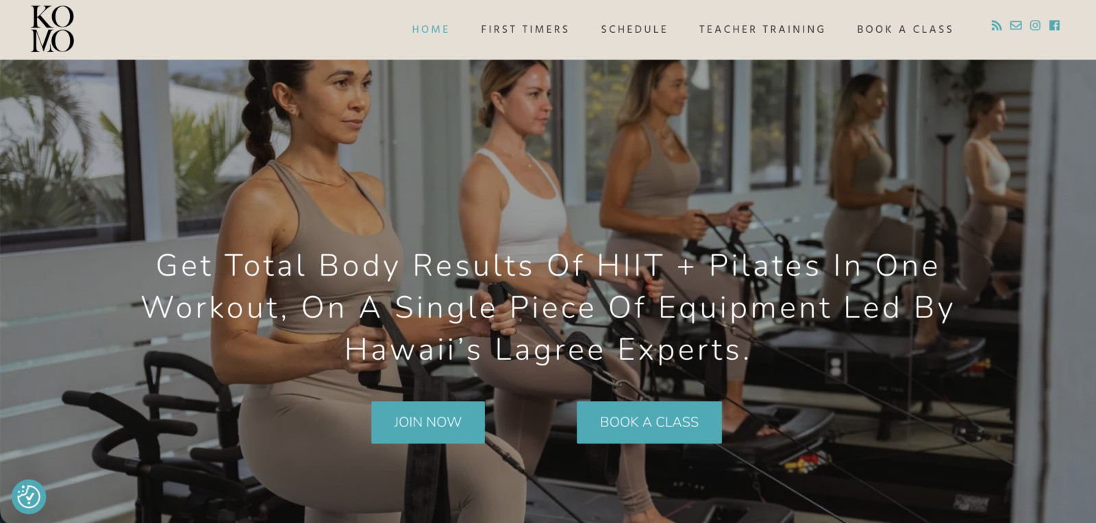
9. Komo Studio
Komo Studio is a Lagree fitness studio based in Kailua, Hawaii, specializing in Megaformer classes that combine the intensity of HIIT with Pilates. The website is built around conversion — dual “Join Now” and “Book a Class” CTAs appear above the fold, and a clear three-step onboarding sequence walks prospective members through exactly what to expect. Member testimonials are woven throughout, and a dedicated First Timers page reduces the hesitation that often stops new visitors from committing.
The studio runs on ABC Glofox, with a branded app that members can download to book and manage classes on the go.
“I see ABC Glofox as a holistic overall partner, not just as a booking platform but as a partner for our growth.”
– Joy Bitonio, Founder – Komo Studio
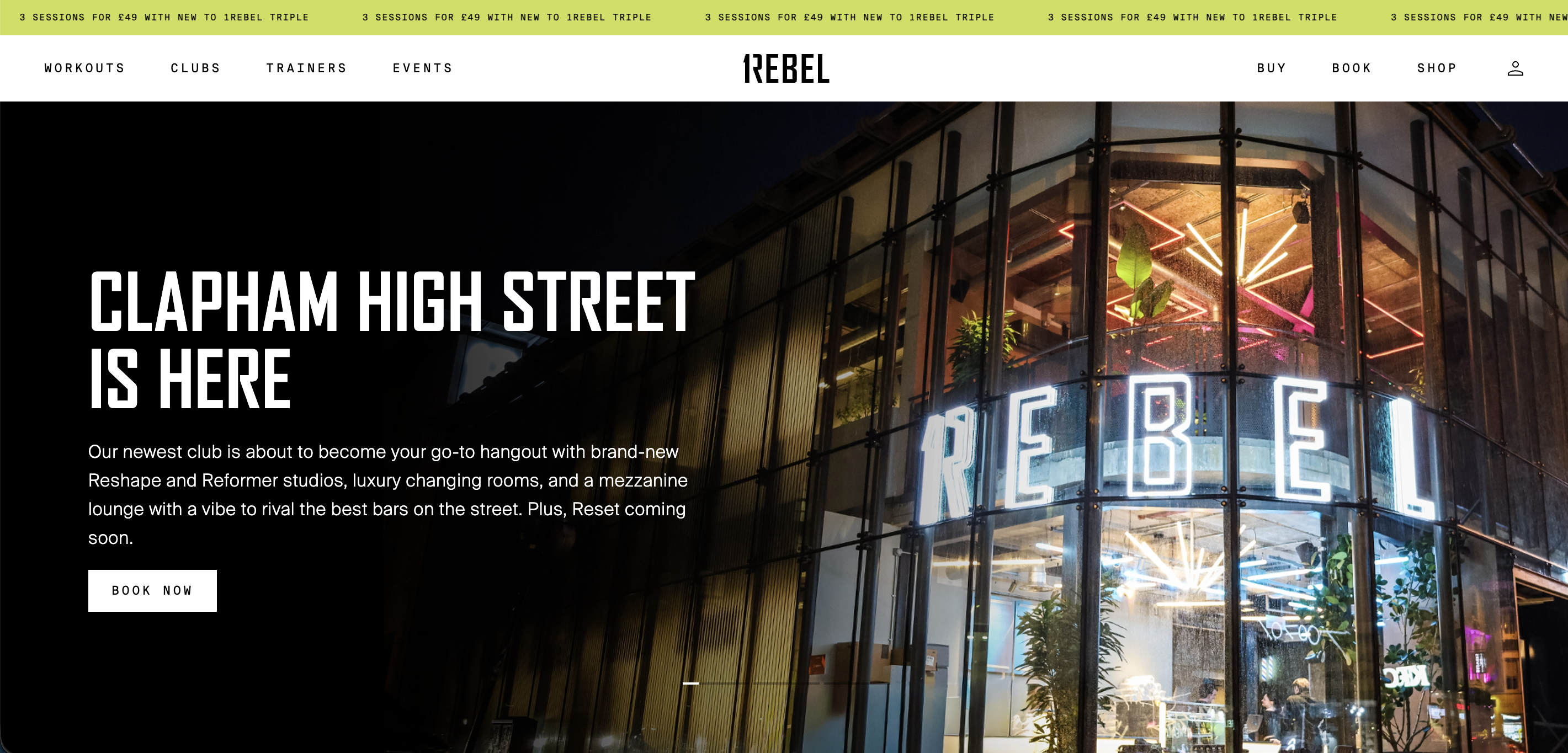
10. 1Rebel
London’s 1Rebel has grown into one of the UK’s most premium boutique fitness brands, with 13 clubs across the city offering Ride, Reshape, Reformer, Rumble, and a recovery concept called Reset. The website leads with a scrolling new member offer in a banner above the navigation, and dedicated “Buy” and “Book” CTAs sit persistently in the top right, keeping the conversion path clear at every stage of the visit.
The music-driven identity that made 1Rebel’s classes famous translates well online, too: an upcoming events calendar showcases artist-themed Ride sessions, giving prospective members a vivid sense of what a class actually feels like before they commit.
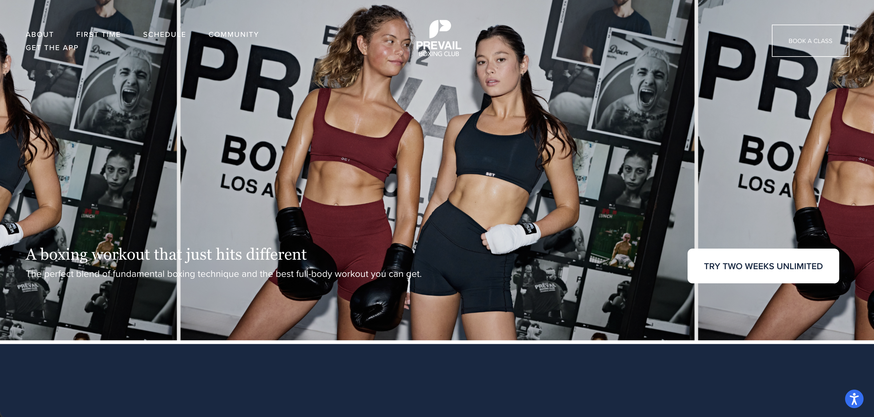
11. Prevail Boxing
LA’s Prevail Boxing has a clean, image-led homepage that lets real in-studio photography do the talking. A scrolling gallery of candid class shots gives prospective members an immediate sense of the energy and community before they’ve read a word.
The hero section leads with outcome-focused copy and a “Try Two Weeks Unlimited” CTA that lowers the barrier to entry right from the start. Navigation is minimal and purposeful, with dedicated pages for First Time visitors, The Workout, and Pricing — everything a prospective member needs to make a decision, without the clutter.
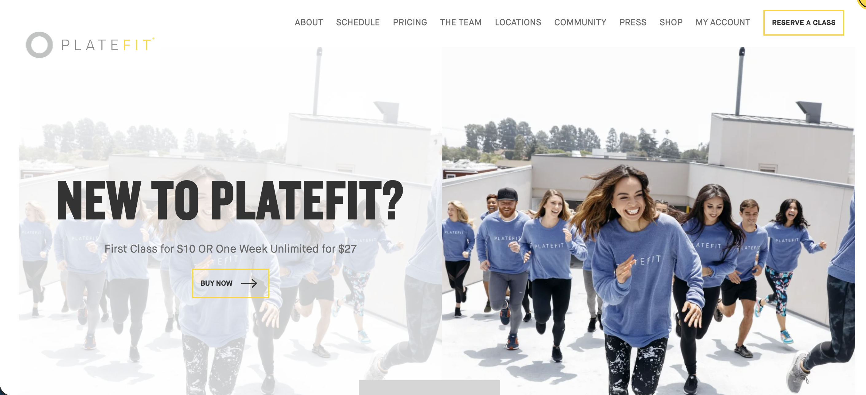
12. PlateFit
LA’s PlateFit is a vibration training studio built around 27-minute Power Plate workouts, and the website wastes no time making the case for both. A new member offer — first class for $10 or one week unlimited for $27 — leads the homepage hero, giving prospective members an immediate, low-risk entry point.
The site uses a lead capture form that triggers on load, collecting name, email, and phone number before a visitor has had a chance to browse and leave. It’s one of the more proactive lead generation setups you’ll see on a boutique studio website, and a useful reminder that capturing interest early is always a good strategy.
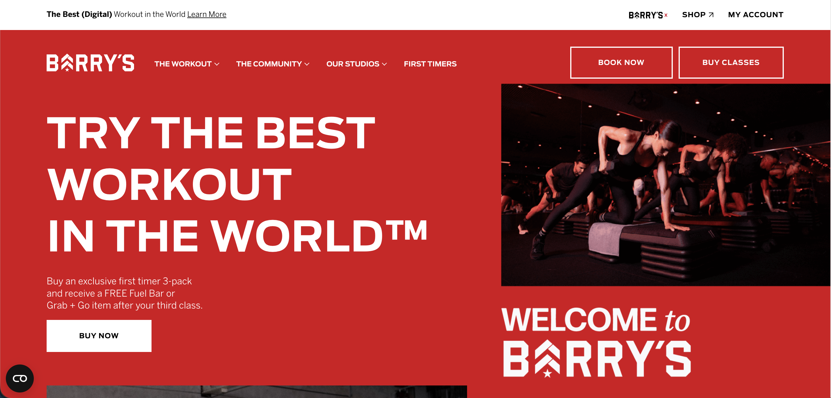
13. Barry’s
Barry’s is one of the world’s most recognized boutique fitness brands, with studios across the US and internationally.
The website matches the brand’s high-energy identity: bold typography, dark imagery, and a persistent dual CTA (“Book Now” / “Buy Classes”) in the top navigation that keeps the conversion path visible at every scroll. A dedicated First Timers page removes hesitation for new visitors, while a loyalty program, on-demand app, and global studio finder give returning members everything they need in one place.
For a multi-location brand, it’s a strong example of maintaining a consistent identity across a complex website.
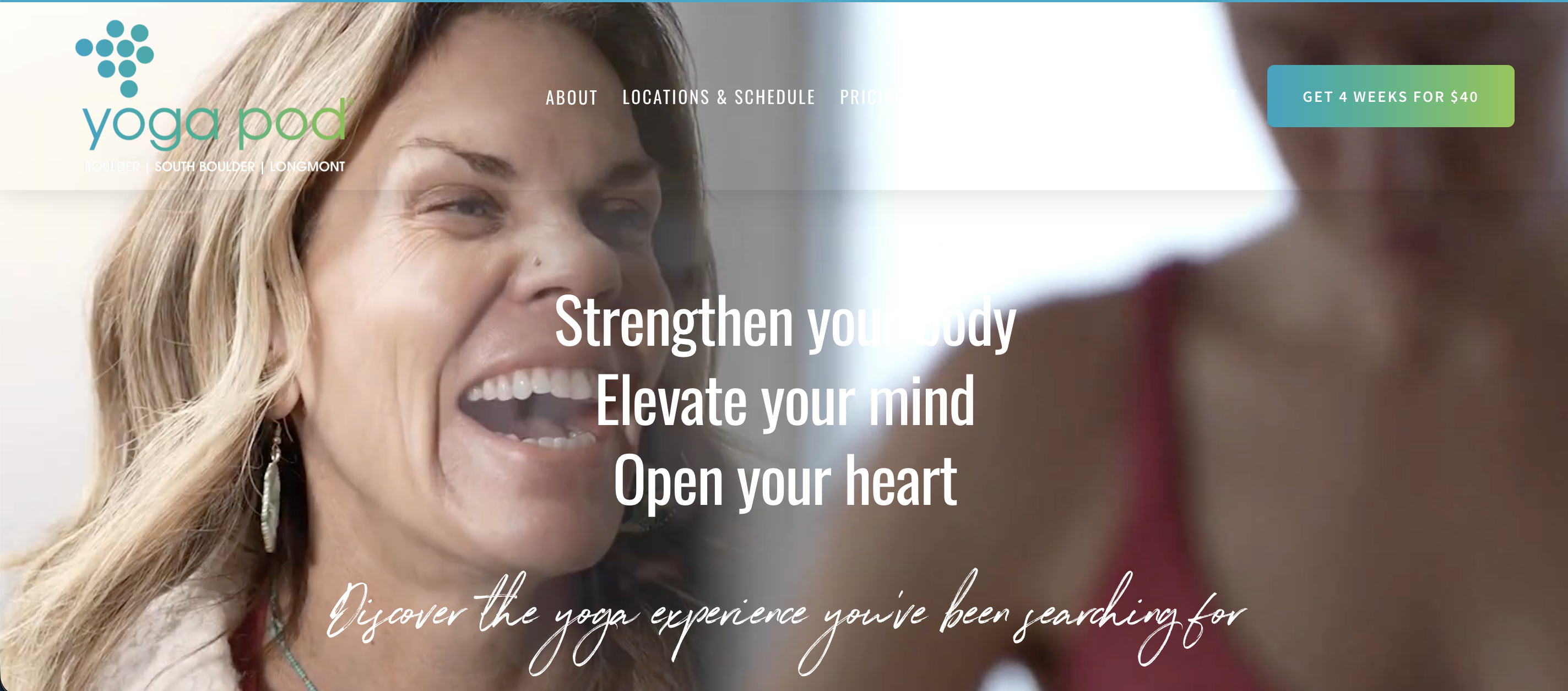
14. Yoga Pod
Colorado’s Yoga Pod is a multi-location yoga studio with a warm, community-led website that makes new visitors feel welcome immediately. A “4 weeks for $40” introductory offer leads the homepage hero alongside direct links to each studio’s schedule, so prospective members can go from landing on the page to booking a class in seconds.
Testimonials are woven throughout, and a dedicated live stream section extends the studio’s reach beyond its physical locations. It’s a strong example of a boutique yoga studio website that balances personality with a clear conversion path.
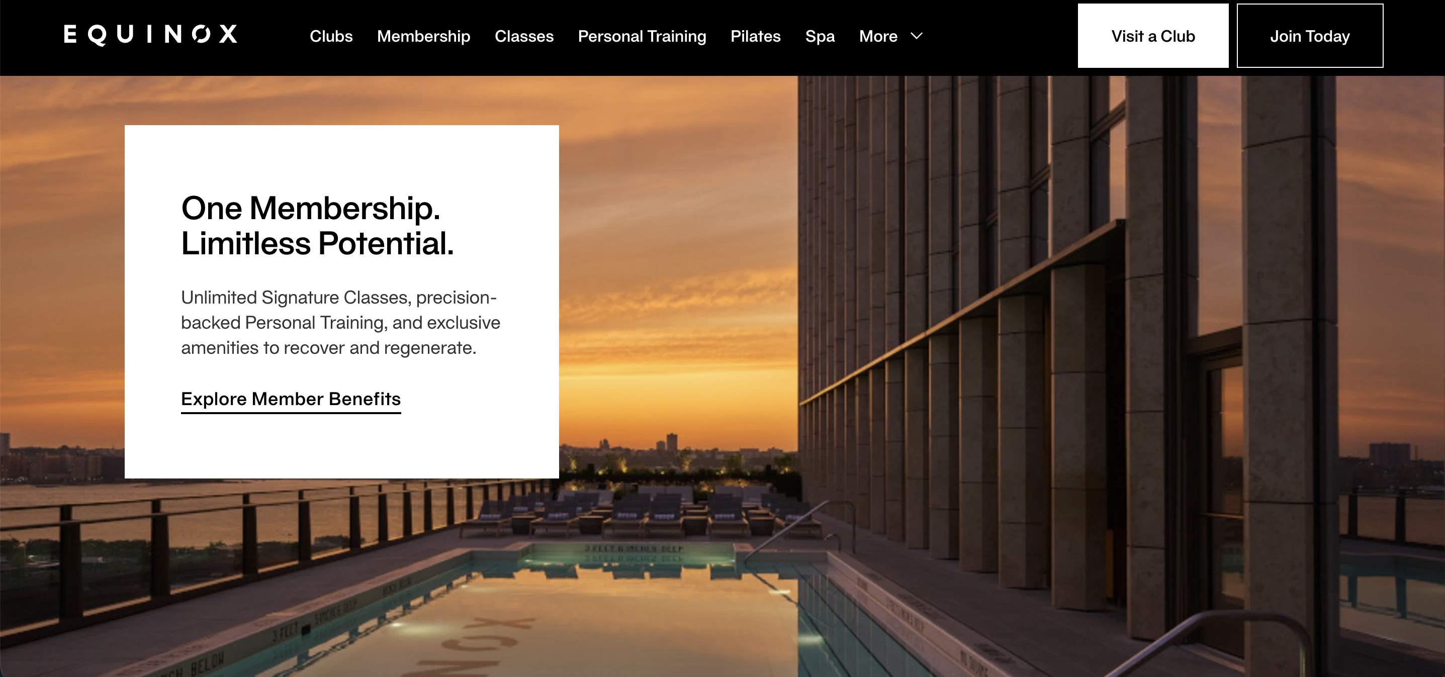
15. Equinox
Equinox is the benchmark for premium gym website design. The homepage leads with aspirational fashion-campaign imagery, a single “Join Now” CTA, and no pricing visible anywhere — a deliberate choice that uses exclusivity as a conversion tool rather than transparency. Each section of the site describes what membership feels like rather than just what it includes, from signature group fitness classes to spa treatments and award-winning club design.
For gym owners, it’s a reminder that a strong enough brand identity can do the selling before a single price or feature is mentioned.
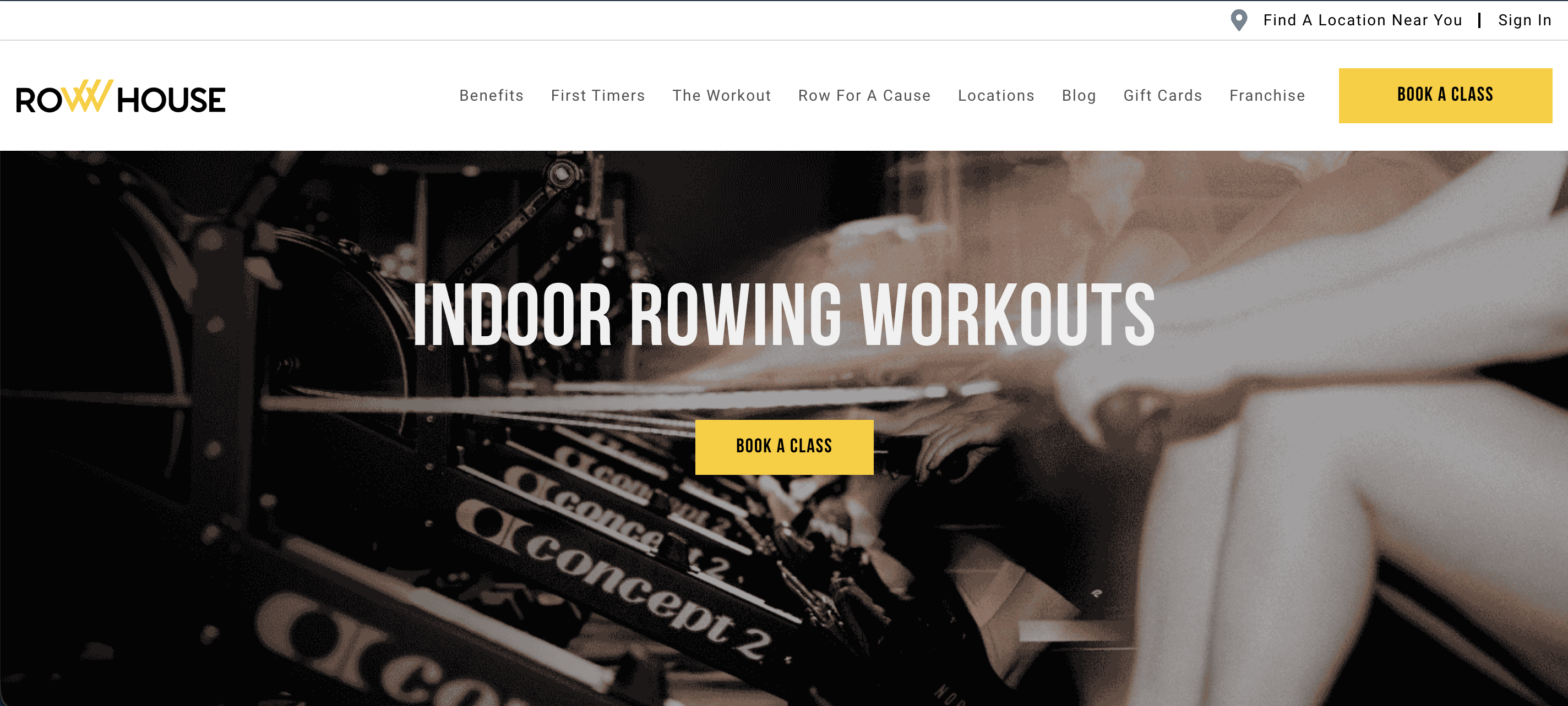
16. Row House
Row House is a US rowing studio franchise with locations across the country, and its website does a good job of selling a niche format to first-time visitors.
The homepage clearly explains what indoor rowing delivers — low-impact cardio, full-body strength, all fitness levels — before asking anyone to commit. A persistent “Book a Class” CTA and a dedicated First Timers page reduce friction at every stage, while press logos from the New York Times, Forbes, and Wall Street Journal provide instant credibility. It’s a clean, well-structured example of a franchise gym website built around education and conversion.
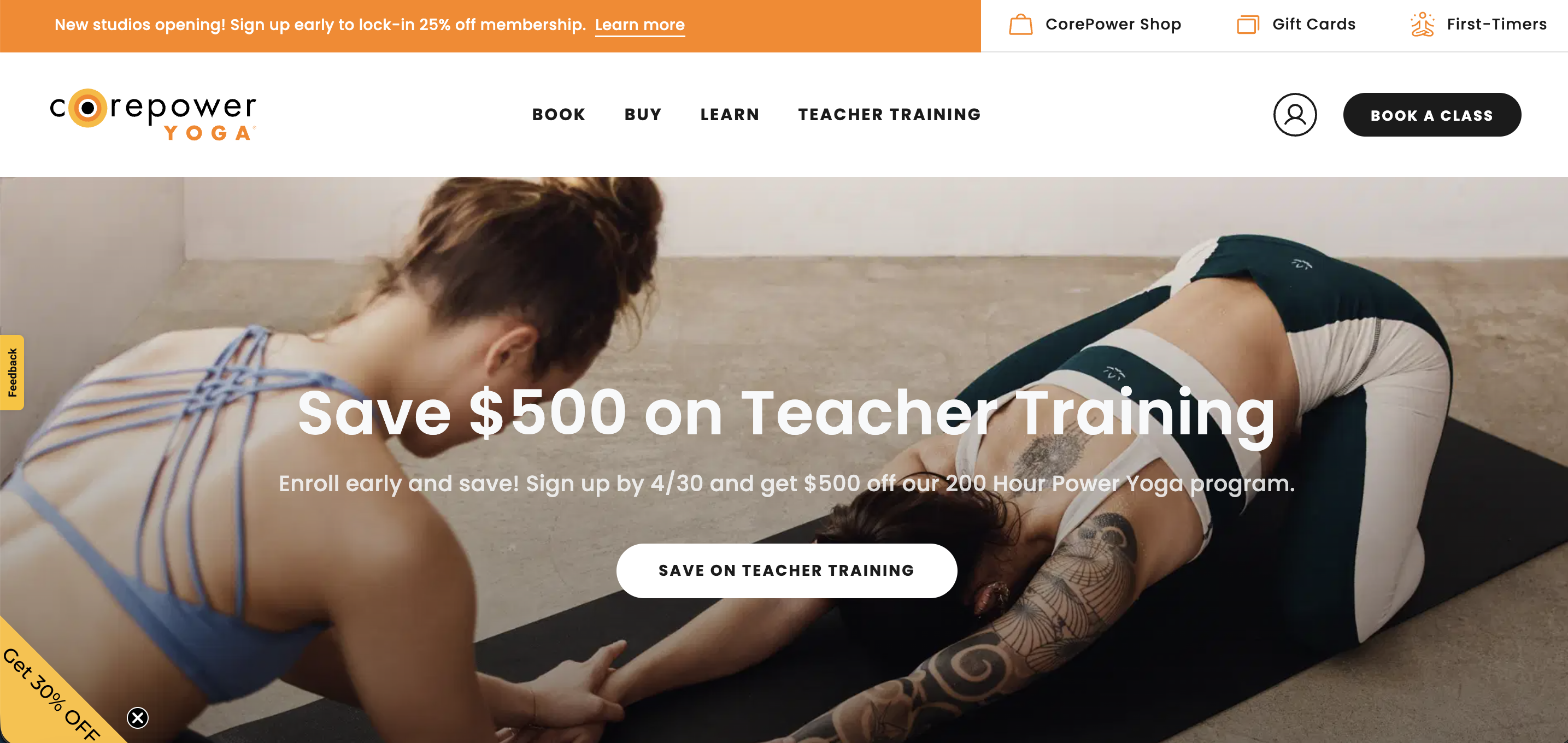
17. CorePower Yoga
CorePower Yoga is one of America’s largest yoga studio chains, and the website handles this scale without feeling corporate.
A rotating hero carousel surfaces multiple entry points — new student offers, membership options, teacher training — so different visitors can find their on-ramp immediately. Three distinct membership tiers are laid out clearly below the fold, alongside in-studio, live stream, and on-demand options, giving prospective members a complete picture of what’s available before they commit.
A dedicated First-Timers page and a carousel of specific member testimonials round out a site that balances conversion with genuine community feel.
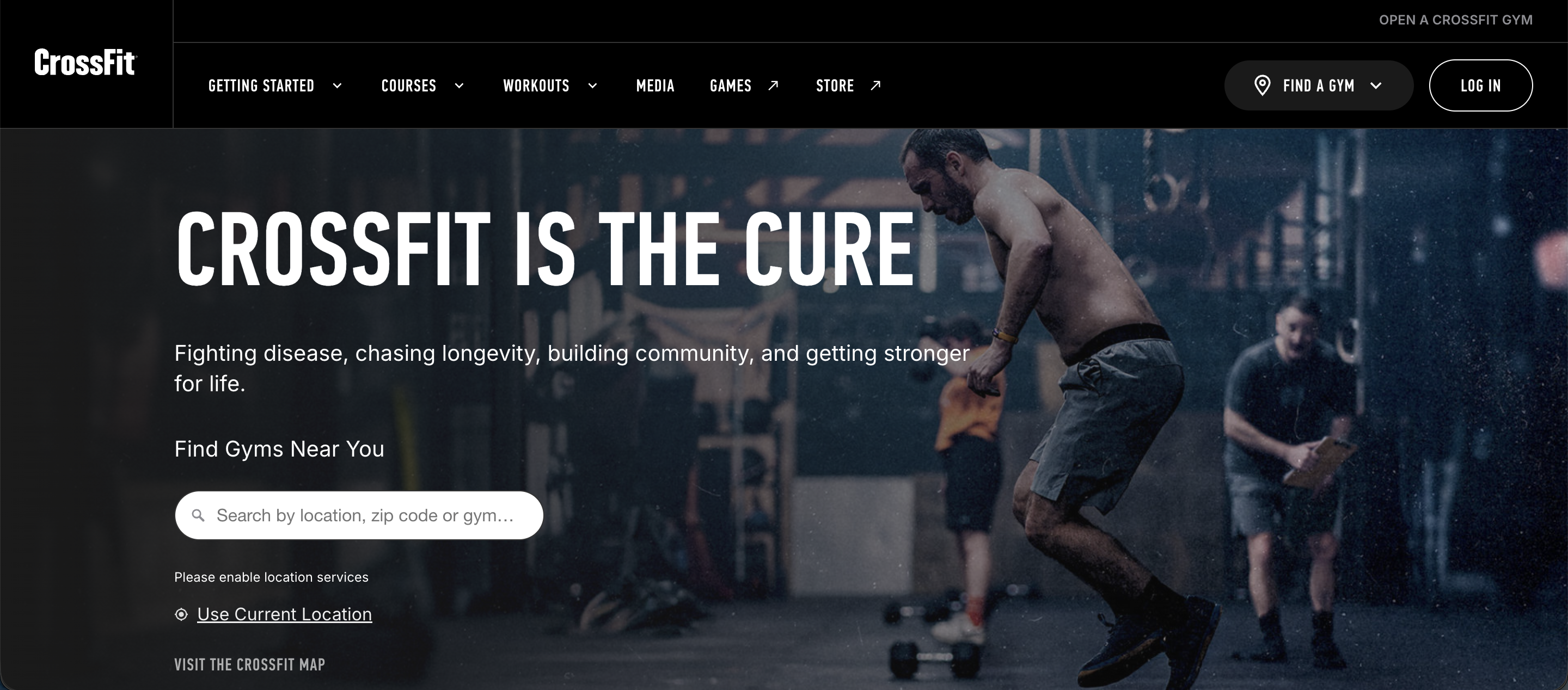
18. CrossFit
CrossFit is a useful contrast to every other example on this list. Rather than selling memberships directly, the homepage functions as a content and education hub — daily workouts, coach certification courses, a global affiliate gym finder, and community resources — directing visitors to local gyms to complete the conversion.
It’s a reminder that a gym website doesn’t have to follow a single formula. For a global brand with thousands of affiliates worldwide, building trust through content and community is the conversion strategy.
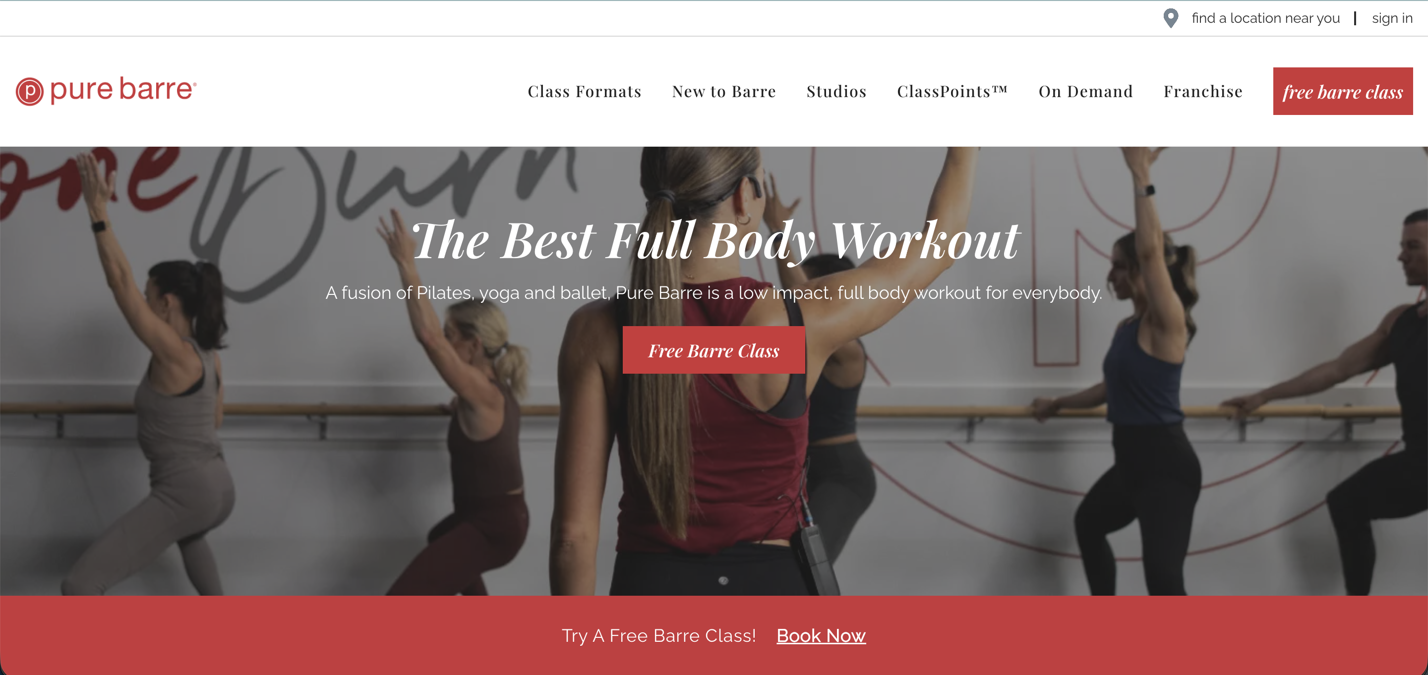
19. Pure Barre
Pure Barre is a barre franchise with studios across the US, and its website makes a strong first impression with a simple, elegant design that matches the brand’s tone.
A “Free Barre Class” CTA leads the hero and repeats throughout the page — one of the more persistent and effective lead generation setups in the boutique fitness space.
Four distinct class formats are explained clearly with descriptions and visuals, making it easy for a new visitor to understand what they’re signing up for. Member testimonials go beyond generic praise, with specific transformation stories that speak directly to prospective members’ goals.
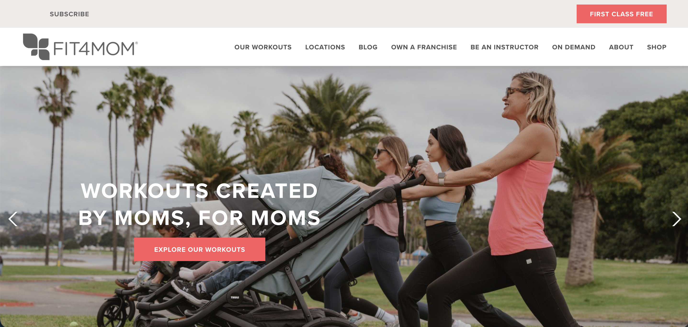
20. Fit4Mom
FIT4MOM is a US franchise fitness brand built entirely around the motherhood journey, from pregnancy through postpartum and beyond. The website earns its place on this list for one reason above all others: crystal-clear niche positioning. Every element speaks directly to a single, specific audience.
A “First Class Free” CTA appears multiple times throughout the page, and three distinct pathways (try a class, start a franchise, become an instructor) ensure that different types of visitors always have a clear next step. For studio owners, it’s a strong example of what happens when a website fully commits to speaking to one person.
How to Turn Your Gym Website Into a Lead Generation Machine
Good gym website design is only half the equation. The other half is making sure that visitors who land on your site actually do something, like book a class, start a trial, or at minimum leave their contact details.
Most gym websites lose leads not because of poor design, but because the conversion path breaks down somewhere between the first click and the follow-up. The sections below cover the four areas where that breakdown most commonly happens.
#1 – CTA placement and hierarchy
Your primary CTA — whether that’s “Book a Free Trial,” “Claim Your First Class,” or “Get Started” — needs to be visible above the fold (e.g., the top portion of a webpage that is visible immediately without scrolling). Visitors should never have to scroll to find the first action they can take.
One primary CTA per page is the standard. Multiple competing options split a visitor’s attention and reduce the likelihood of any action being taken at all. Secondary actions like pricing details or class schedules belong lower on the page, once a visitor has had a chance to orient themselves.
The copy on your CTA matters more than most gym owners realize. “Book Your Free Trial” consistently outperforms “Learn More” or “Get Started” because it names the outcome. Visitors arriving from a paid ad are often ready to act; your CTA should meet their level of intent.
📝 Read More: Gym Landing Page: Build One That Converts Free Trials
#2 – Lead capture form design
Short forms convert better. Name, email, and phone number are enough to open the conversation, and anything beyond that can be gathered during follow-up. The goal of your form is to start a relationship, not complete a file.
Place your form where the decision happens: above the fold on a dedicated trial page, or immediately below the hero section on your homepage. Every additional step between “I’m interested” and “I’ve submitted” costs you conversions.
Reduce friction wherever you can. Clear field labels, a single-click submit button, and a brief note explaining what happens next (“We’ll be in touch within 24 hours to book your trial”) all make a difference. Long forms and vague next steps are the two most common reasons gym website visitors abandon without converting.
📝 Read More: Generate High Quality Leads With This Proven Lead Capture Form Plan
#3 – Trust signals and social proof
Visitors want to picture themselves in your space before they commit. This is why real photos of actual members working out tend to carry more weight than polished stock imagery.
Google reviews and star ratings placed near your CTA reduce hesitation at the exact moment of decision. A short, specific testimonial from someone who looks like your ideal member is more persuasive than a five-star rating alone. (Consider the difference between “I lost 8kg in my first 10 weeks” and “Great gym, highly recommend”).
Affiliations, certifications, and press mentions near the top of your page immediately establish credibility.
#4 – Connecting your website to your member management system
A well-designed page with a well-placed form still fails if the lead goes nowhere after submission. When a prospective member fills out your trial form, they should immediately receive an automated confirmation and a booking link — not a generic “thank you” page with no clear next step.
The window between a lead submitting their details and losing interest is shorter than most gym owners expect. The faster and more consistently you follow up, the higher your conversion rate.
ABC Glofox connects your website lead capture directly to your CRM, triggering automated welcome sequences so every inquiry is followed up quickly and consistently — whether it comes in at 9am or 9pm.

FAQs: Gym Website Design and Lead Generation
What makes a good gym website design?
A good gym website design is fast, mobile-friendly, and built around a clear conversion path. Visitors should be able to find your class schedule, understand your offer, and take action, all within the first scroll.
What should a gym website include to convert visitors?
At minimum: a clear primary CTA above the fold, a short lead capture form, social proof near the point of decision, and a First Timers or New Members page that reduces hesitation for prospective members who aren’t quite ready to commit.
How do I get more leads from my gym website?
Start with CTA placement and form design. Most gyms lose leads because the conversion path is unclear or the form asks for too much upfront. Once those are optimized, make sure every lead is followed up automatically and quickly through your member management system.
How do I connect my gym website to my booking system?
Most gym management platforms, including ABC Glofox, offer website integration that connects your lead capture forms directly to your CRM and booking calendar. When a prospective member submits a form, they’re automatically enrolled in a welcome sequence and given a direct link to book their first class.
Generate and Convert More Leads with ABC Glofox
Want to know something interesting? Many of the fitness businesses listed above use ABC Glofox to power their operations.
Using our platform as a lead-generating machine, these businesses can create and send automated emails to all potential leads that come through their website. Once they’ve signed up through our platform, new members are then sent an automated e-agreement, a simple way to enter their payment details, and an automated onboarding experience that teaches them how to get the most out of their new gym or studio. Finally, members can easily use the custom-branded app provided by ABC Glofox to book a class or session.
ABC Glofox allows these businesses to elevate and personalize the member experience, while also saving them a considerable amount of time and money in the long run.
Want to learn how ABC Glofox can help grow your fitness business? Get your free demo today!
Table of contents