
TL;DR: A gym landing page has one job: to pre-sell the in-person experience and get prospective members to book a trial. Each element on the page should serve that single goal.
You’re spending money on ads and prospective members are clicking through to your free trial offer. So, why does nothing happen from there?
The problem usually starts with your gym landing page, the page visitors land on. If your gym lead generation efforts are bringing in clicks but nobody’s filling out the form, the page itself is probably what’s getting in the way.
Your fitness landing page isn’t supposed to close the sale. It’s the first handshake between your brand and a prospective member. Its only job is to get the right person to show up for the trial.
Below, we cover what belongs on gym landing page examples, along with how ABC Glofox helps turn sign-ups into paying members. Let’s get started.
Table of Contents
- Why Most Gym Landing Pages Don't Convert
- The Anatomy of a High-Converting Gym Landing Page
- CTA Strategy for Free Trial Sign-Ups
- Form Optimization for Gym Trial Pages
- A/B Testing Your Gym Landing Page
- Page Speed and Mobile Performance
- Gym Landing Page Examples to Inspire Your Design
- FAQs: Gym Landing Page Conversion Tips
Why Most Gym Landing Pages Don’t Convert
Most gym website landing pages fail for two reasons: they either look like homepages or they’re built for the wrong goal. Let’s take a closer look at each.
#1 – They’re built like homepages
A homepage serves everyone: current members checking the schedule and prospective members browsing class offerings. That’s fine for a homepage. But it’s terrible for a landing page.
Navigation links and multiple offers divide your visitor’s attention. When someone arrives from an ad promoting a free 7-day trial, the page should be about that trial only.
Class descriptions and trainer bios can live on your main website. The landing page should only feature content that encourages trial sign-ups.
📝 Read More: How to Create a Gym Website
#2 – They’re built for the wrong goal
Most fitness landing page templates are designed for e-commerce or app downloads. They assume the visitor will buy something on the page.
A gym trial page works differently. It’s capturing a lead so your team can get that person through the door. The conversion that matters, from trial to membership, happens in person.
Your gym website landing page just needs to pre-sell the trial experience enough that a visitor shares their contact details.
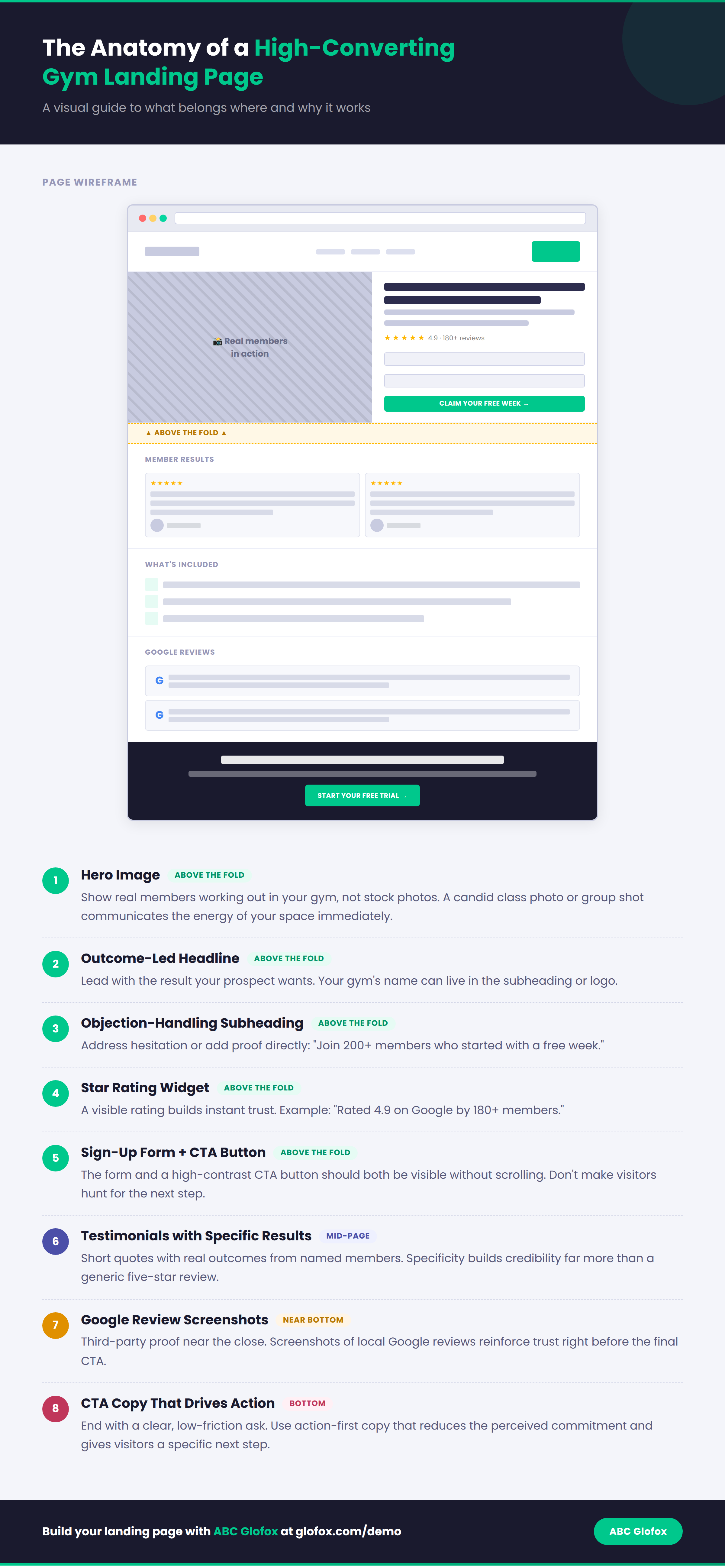
The Anatomy of a High-Converting Gym Landing Page
Visitors spend 57% of their viewing time above the fold, which means the top section of your page carries the most weight.
Above-the-fold structure
Website visitors want to picture themselves in your space. That’s why your hero image should show real people working out in your gym, not stock photos.. A candid class photo or group shot communicates the energy immediately.
Pair the image with a headline that leads with the outcome. (Your gym’s name can go in the subheading or logo.) The rest of the above-the-fold section should include:
- A subheading that addresses a common objection or adds proof (“Join 200+ members who started with a free week”)
- A CTA button in a high-contrast color, visible without scrolling
- The sign-up form itself, right there above the fold
Effective gym landing page examples follow this pattern consistently: the best pages put the full conversion path within that first screen.
Headline formulas that work for gym trials
Your headline needs to name the offer and remove risk upfront. Three formulas that work well for a fitness landing page promoting a free trial:
Outcome + time frame + no risk: “Train free for 7 days. No contract. No credit card.”
Who it’s for + what they get: “New to [City]? Try your first week at [Gym Name] on us.”
Question + answer: “Looking for a gym you’ll stick with? Start with a free trial.”
Which formula works best depends on your audience. A HIIT studio crowd might respond to urgency. Whereas a full-service gym promoting a broader fitness program might respond better to something reassuring.
📝 Read More: 10 Fitness Studio Marketing Ideas to Win Your First 100 Members
Social proof placement
Social proof on a fitness landing page needs to feel local. National brands can get away with aggregate user counts. A boutique studio needs to build trust with proof from actual people nearby.
Above the fold, a star rating widget works well: “Rated 4.9 on Google by 180+ members.”
Mid-page, include short testimonials with specific results. “I lost 12 lbs in my first 6 weeks” does more than “Great gym!”
Near the bottom, screenshots of local Google reviews perform better than blocks of generic testimonials.

CTA Strategy for Free Trial Sign-Ups
The CTA on your gym website landing page should open the door to an in-person experience. High converting calls to action on gym trial pages look different from e-commerce buttons, and the copy should reflect that.
CTA copy that drives action
Most gym landing page examples use generic CTAs like “Submit” or “Sign Up.”
Copy like “Claim My Free Week” or “Book My First Class” puts the visitor one step closer to the in-person experience.
Urgency can help if it’s genuine. “Only 10 trial spots available this month” only works when it’s true. Promo codes tied to a limited window can create perceived scarcity.
However, constantly using urgency to drive sign-ups can erode trust, especially for a local business. Keep in mind that trust is what moves prospective members through your gym sales funnel, so use scarcity messaging wisely.
Thank-you page and what comes next
The best gym landing page examples don’t leave people hanging after they fill out a form. Confirm what happens next: “We’ll call you within 24 hours to book your first session.” At the same time, link them to your class schedule through your gym booking system or a welcome video.
ABC Glofox’s automated CRM helps here.
Leads flow into your system and trigger welcome messaging automatically. A strong lead management process turns that first touch into a booked session.
Form Optimization for Gym Trial Pages
Next, let’s look at how to make the most out of your sign-up form on your gym website landing page.
How many fields is enough?
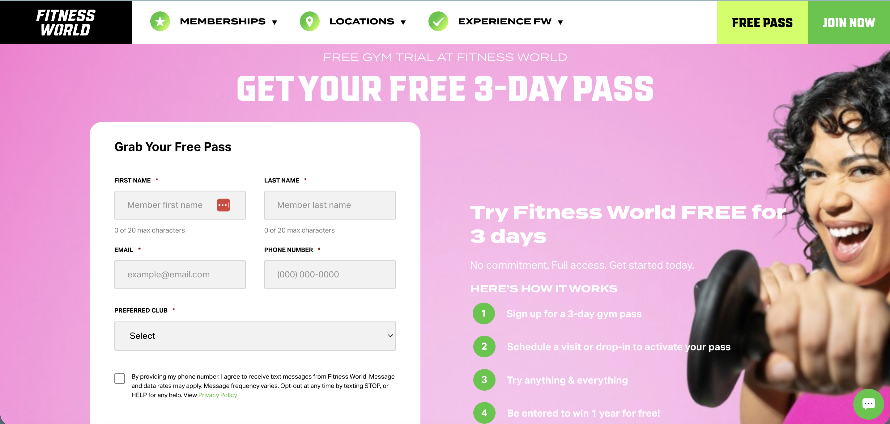
Three form fields convert best for a gym free trial: name, email, phone number. Each field beyond the essentials increases abandonment. For a low-commitment offer like a free trial, you want as little friction as possible.
Some gyms add a fourth field for fitness goals or preferred location. While this approach can improve lead quality, it can cost you lead volume. So you’ll want to test both approaches.
The Top 10 Barriers
Slowing Your Fitness
Business Growth
Discover more Avoid asking for date of birth, gender, or home address at this stage. You can collect this information during onboarding once someone has committed to joining.
Reducing friction at sign-up
Use placeholder text inside each field to reduce perceived effort (“Your first name” works better than an empty box). Stick to a single-column layout, which loads faster and reads better on mobile.
If you’re asking for a phone number, explain why: “So we can confirm your trial before your first session.”
Near the CTA button, add a trust signal: “No credit card required. Cancel anytime.”
📝 Read More: Generate High Quality Leads for Your Fitness Studio
A/B Testing Your Gym Landing Page
Start simple if you’ve never run an A/B test on your fitness landing page. One test + one variable = one winner.
Where to start
Your headline copy is the best first test. Duplicate the page with a different headline and split your ad traffic between the two URLs to see which headline generates more form completions.
The CTA button text is your second test. Try “Book My Free Week” against “Claim My Free Trial.”
Third, test the hero image: a real member photo (with their permission) against a class action shot.
What to measure
Form completion rate (leads divided by visits) is the number that matters for tracking fitness landing page conversions.
A page with 500 visits and 12 sign-ups (2.4% conversion) outperforms one with 2,000 visits and 15 sign-ups (0.75%).
Run each test for 2-3 weeks or 200+ visits per version before drawing any conclusions.
You don’t need expensive software to measure your test results. You can use tools like VWO or ABTasty, or you can simply duplicate the page with a different URL and split your ad traffic manually.
📝 Read More: Everything You Need to Know About Fitness Marketing

Page Speed and Mobile Performance
Gym ad traffic is overwhelmingly mobile. Pages that take longer than 3 seconds to load lose visitors before they even see the headline, so speed on a gym website landing page is critical.
First, compress your images and avoid auto-play video above the fold. Then, run your page through Google PageSpeed Insights as a starting audit.
ABC Glofox’s web booking portal and branded app are built for speed on mobile.
📝 Check Out: Everything You Need to Know About Fitness Website Design
Gym Landing Page Examples to Inspire Your Design
Here are four gym landing page examples, each illustrating a different principle covered above.
Orangetheory Fitness
Orangetheory keeps the sign-up form front and center. The page auto-detects your nearest studio, reducing one more field the visitor would need to fill in.
The whole page stays focused on one goal: booking that first class.

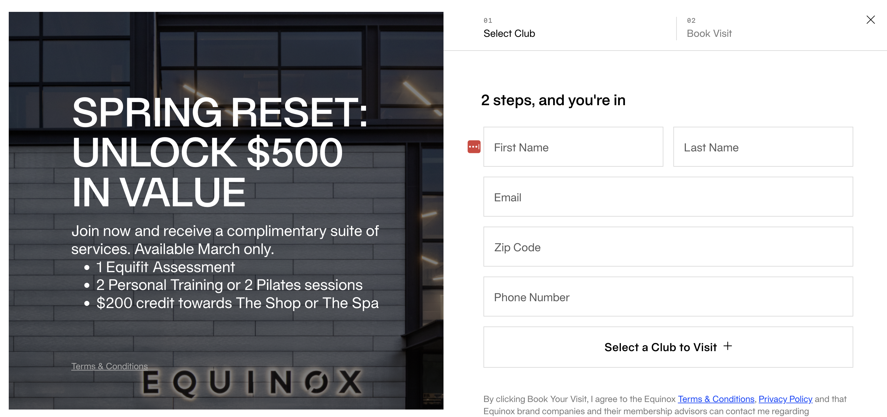
Equinox
Equinox strips away content and navigation on their membership page, presenting a clean form with a premium visual. When your brand is strong enough, you don’t need to over-explain.
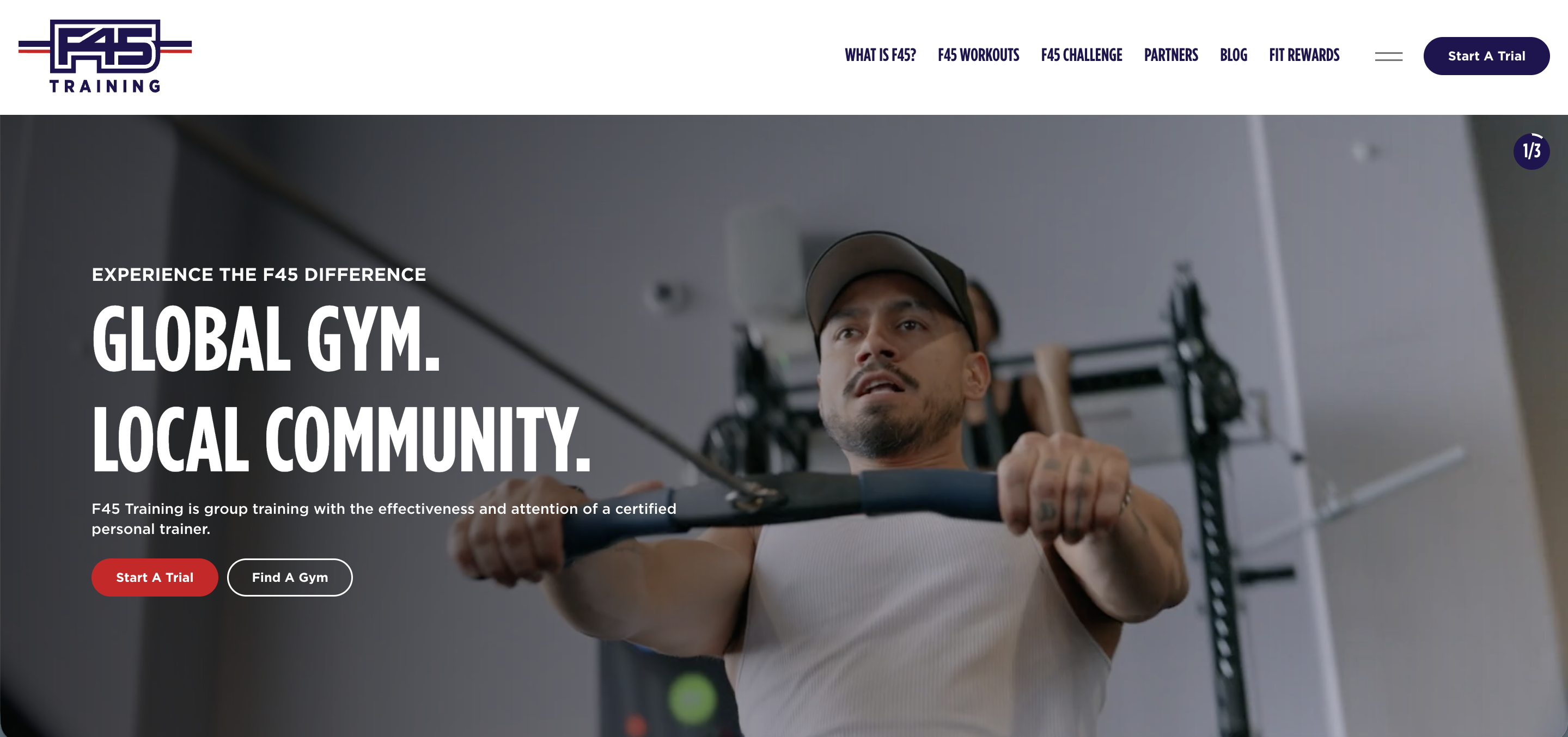
F45 Training
F45’s homepage doubles as a lead capture page. The CTA to find your local studio is positioned in plain sight, and member testimonials create social proof.
The tradeoff is that it works as both homepage and gym landing page, so different sections compete for attention.
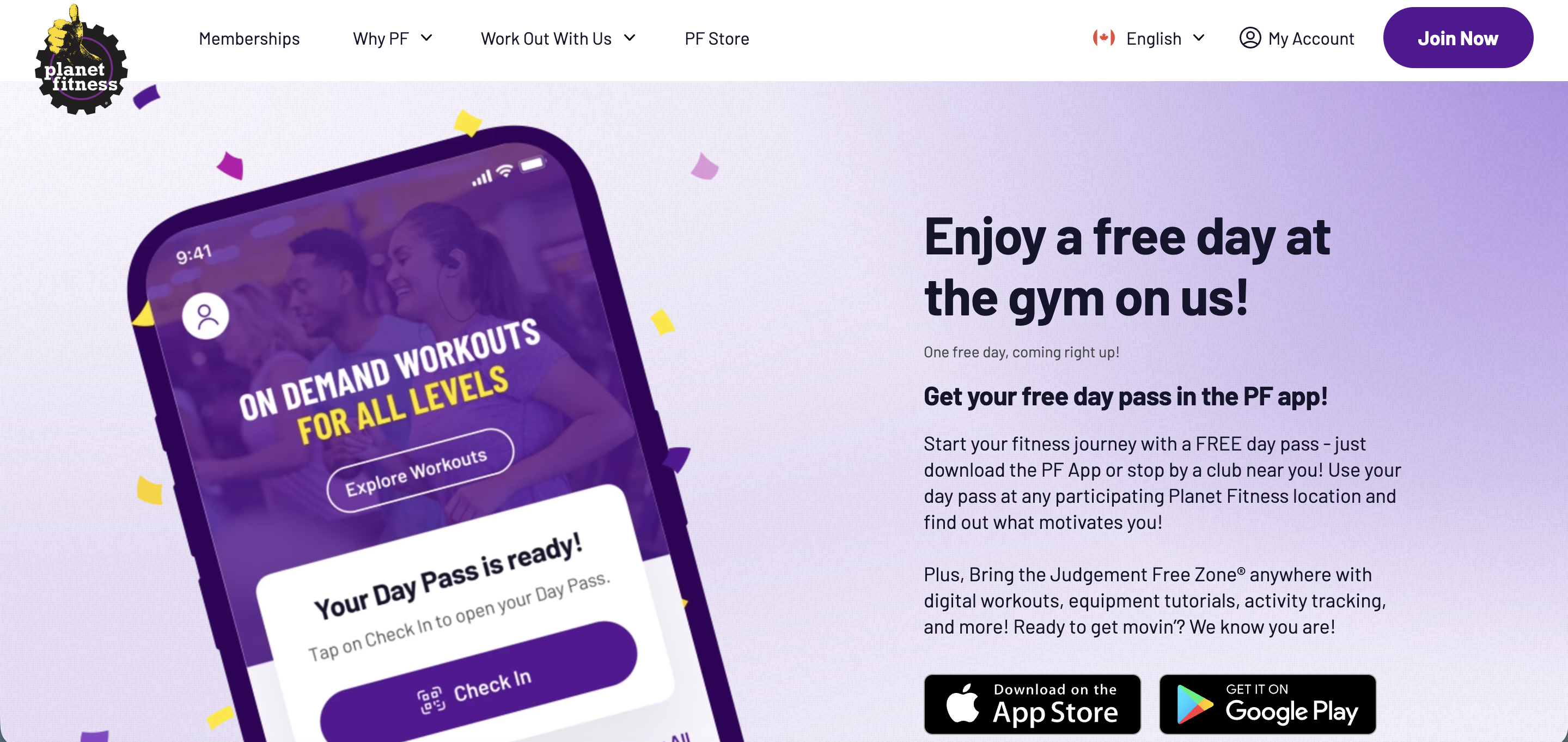
Planet Fitness
Planet Fitness routes sign-ups through their app. Visitors download the PF app to claim a free day pass. This builds a longer-term engagement channel but adds friction upfront.
For most independent gyms, a simple web form on a dedicated gym website landing page will convert better.
FAQs: Gym Landing Page Conversion Tips
What are the three types of landing pages?
Lead generation pages capture contact information. Click-through pages warm up visitors before sending them to a product page. Squeeze pages focus on email capture only.
For gyms running a free trial offer, a lead generation fitness landing page is the right choice.
How many form fields should a gym trial sign-up page have?
Three fields (name, email, phone) tend to convert best. Adding fields can improve lead quality but increase abandonment. Test a four-field version against three to find the right balance for your gym.
What’s the best headline formula for a gym landing page?
The most effective headlines pair a clear outcome with risk removal. For example: “Train Free for 7 Days. No Contract. No Credit Card.”
How does social proof increase gym landing page conversions?
Local social proof, like Google review ratings and specific member results, performs better for gyms than generic testimonials like “great gym!” Place your strongest proof above the fold, so it’s visible right away. The gym landing page examples above show specific placement ideas.
Convert More Trials into Members with ABC Glofox
You’ve built a focused gym landing page and tested what works. Now you need a system that captures those leads and turns them into members.
ABC Glofox brings your lead capture, CRM, and automated follow-up in one intuitive platform. So when a prospective member fills out your trial form, they’re immediately connected to automated welcome messaging and trial booking links.
Your fitness landing page gets them interested. ABC Glofox helps turn that interest into paid memberships.

Table of contents
- Why Most Gym Landing Pages Don't Convert
- The Anatomy of a High-Converting Gym Landing Page
- CTA Strategy for Free Trial Sign-Ups
- Form Optimization for Gym Trial Pages
- A/B Testing Your Gym Landing Page
- Page Speed and Mobile Performance
- Gym Landing Page Examples to Inspire Your Design
- FAQs: Gym Landing Page Conversion Tips