When starting your fitness business, working on your logo might not be a top priority. Logo design is one of those things that’s easy to relegate to the bottom of your to-do list. Especially as coming up with fitness logo ideas can be challenging.
A solid logo is the foundation of your brand identity. It communicates your message and is often the element that makes your first impression. And a good first impression goes a long way.
Designing a logo that perfectly communicates who you are and what you do can be tricky. So in this article, we will look at why a logo is important for your fitness business and share some great fitness logo ideas to inspire you.
Skip ahead to:
- Why Is a Logo Important for Your Fitness Business?
- What Are the Elements of a Great Logo?
- 2 Examples of Classic Logos
- 5 Fitness Logo Ideas to Inspire Your Design
Why Is a Logo Important for Your Fitness Business?
Paul Rand, legendary graphic designer and the man behind the logos for IBM, UPS, and ABC, put it well when he said: “If, in the business of communications, ‘image is king,’ the essence of this image, the logo, is the jewel in its crown.”
Indeed your logo is the single most important piece of graphic design when it comes to your business. So let’s break down the reasons why:
Your Logo Is the Foundation of Your Brand Identity
As we’ve discussed previously, good branding is about telling a story that influences your customer’s emotions. And while your logo only forms a small part of your overall branding strategy, it lays the foundation for everything else that’s to come.
Just think about the difference in your emotional response between a Rolex logo and a Casio Watches logo. Neither is necessarily better, but both are telling their brand story and communicating what they’re about.
A good logo uses fonts, colors, and graphics to depict the story you’re trying to tell. It makes a brand instantly recognizable on letters, emails, business cards, and landing pages and gives customers a sense of familiarity and trust.
Your Logo Distinguishes You From the Competition
Your logo is the medium through which you can show potential customers what makes you better than your competition.
A top-notch logo communicates your company’s core values in graphic form and presents them to your customers – your business might be fun, efficient, professional or laid-back.
Whatever you’re about, you want your approach to fitness logo design to convey why you’re a cut above the rest.
Your Logo Grabs Attention
In our current climate of dwindling attention spans, logos are becoming more and more important. There’s only a short amount of time in which you can convince a customer that your fitness studio is worth consideration. That’s where your custom logo becomes your secret weapon.
Research shows that our brains process images 60,000 times faster than we process text. So, a quality logo gives you the chance to say, ‘Hey! Look at me!’ If you can grab just 2 seconds of a potential customer’s attention and within that time frame communicate what you’re all about, then you’ll stand a better chance of sticking in their mind.
Your Logo Fosters Brand Loyalty
Have you ever found yourself a little annoyed when a well-known company does a re-brand? Or anytime that Facebook would release an update, and we’d all want it to revert to the way things were before?
That’s because as customers, we love consistency. As your fitness business grows, your logo is going to become familiar with your customers, and that familiarity creates the perception that you’re trustworthy and reliable.
Just think about the last time you went out to buy trainers. The moment you saw the Nike swoosh, you probably whipped out your credit card and were primed to buy. Why? Because that logo puts your concerns at ease – It’s associated with a certain level of quality and performance.
No matter if you’re a personal trainer or a fitness studio, the same thing will happen with your logo – once customers get to like you, they’ll keep coming back for more and associate anything with your logo on it with the positive attributes that your fitness business exudes.
What Are the Elements of a Great Logo?
So now you know that a logo is important. But what separates good logos from bad ones, and how can you create a killer fitness logo that’ll bring your brand all of the benefits?
Let’s dive into the key design elements that make a kick-ass logo. That way, you can work with your designer or go it alone using a fitness logo maker and tick off the boxes one by one.
The Best Logos Are Simple
All of the world’s top logos give the viewer an immediate sense of what the brand is about and feature a clean and uncluttered design. As a general rule, less is more when it comes to designing logos that make an impact.
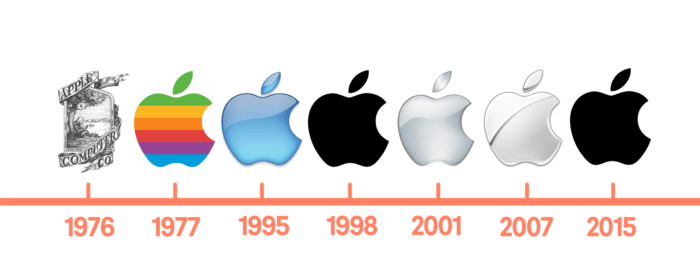
Take a look at Apple’s logo history. The brand’s first logo is complex with unnecessary detail – a far cry from the one we recognize today. Within a year, it had changed to the simple and iconic logo we now all know.
Stick to a few integral design elements that are easily identified, even at a distance. Any elements that aren’t pulling their weight need to be removed pronto.
The Best Logos Are Memorable
You want customers to be able to recall your logo at a glance. Give your friends a few milliseconds to look at your logo and then ask them to recall the main details. If they can immediately recognize and recall the essential elements of your logo – “It’s a man lifting a dumbbell” – then you’re in business.
The Top 10 Barriers
Slowing Your Fitness
Business Growth
Discover more
Generally, more complex logos, logos with multiple parts, or heavily stylized logos are more difficult to understand and recall. This means they’re more likely to be overlooked and forgotten. So don’t fall into the trap of creating an artistic masterpiece – keep things paired back and easy to comprehend.
The Best Logos Are Timeless
Googling “Nike’s logo over the years” reveals that the sports equipment manufacturer hasn’t altered its logo a great deal since its inception in the 1980s. Which highlights a key element of any great logo – they’re designed to last forever.

But here’s the thing, when Nike’s logo was first introduced, it fitted the companies image of being modern and relevant – so how does it not look horribly retro to our modern eyes?
The answer is to avoid designing your logo by following hot trends, and instead use the principles of timeless design. Your logo should be contemporary, but without features that might make it look outdated within a few years. Ask yourself, ‘Will this logo still be relevant in 5, 10, 15, and 20 years?”
The Best Logos Are Proportional and Balanced
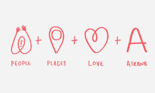
Our eyes are naturally drawn to proportional and balanced images. Great logos take advantage of this by incorporating these elements into their design. Think about fashion brand Chanel and vacation rental site Airbnb for examples of logos that utilize proportionality well to create a pleasing aesthetic quality.
The story behind Airbnb’s logo also cleverly depicts a breakdown of everything the brand stands for:
The Best Logos Are Versatile
What looks good on a computer screen also has to dazzle eyes when printed on a t-shirt, a water bottle or in a newspaper ad. Great logos can maintain their impact and visual appeal across a variety of mediums.
A good designer will take into account other branding elements like colors, textures, and patterns and create a logo that compliments them. Think about all of the contexts that your logo will be reproduced, from websites to letterheads and make sure there’s nowhere it will look out of place.
2 Examples of Classic Logos
Let’s examine two well-known logos that incorporate the design elements outlined above.
Nike
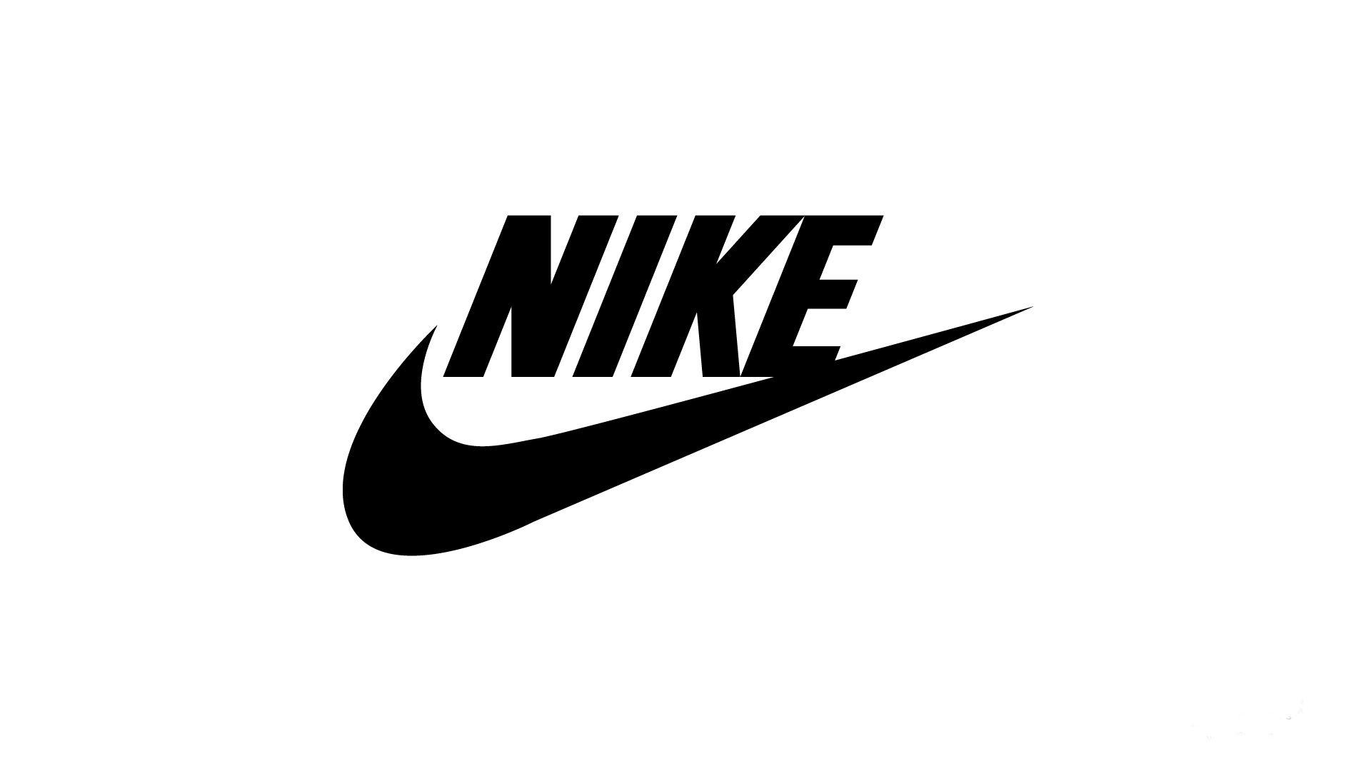
The Nike swoosh is one of the most recognizable emblems in the world. What’s surprising is that Nike’s founder, Phil Knight paid a young graphic designer named Carolyn Davidson just $35 to come up with it.
The swoosh mimics the wing of Nike, the Greek goddess, after which the brand is named. But what makes it excellent is that it makes the viewer feel motion, speed, and power, while also doubling as a symbol of positivity and encouragement.
It’s a fantastic lesson in how to communicate brand attributes through design.
Apple
Apple’s symbol illustrates how your logo doesn’t have to be a graphic illustration of what you actually do, but instead communicate what your brand is about. The logo feels intelligent, sleek and accessible – three key aspects of the company’s vision. It’s also strikingly simple and incredibly memorable.
There are many legends behind the bite missing from the fruit, ranging from myths about Adam and Eve to puns on the memory storage unit ‘byte’. However, the truth is much simpler than all that and is to do with scalability.
Designer Rob Janoff realized that when you shrink a full apple, it looks like a cherry, and in his books that wouldn’t cut it. So, he added the iconic bite, and the rest is history. The lesson? Think about versatility.
5 Fitness Logo Ideas to Inspire Your Design
1. Orangetheory
Orangetheory is one of the most successful fitness franchises in recent memory. A big part of its success lies in its distinctive orange branding and “splat” like logo. The logo is inspired by a fat cell bursting when a person engages in hight intensity exercise. Members should aim to get 12 splat points in the Orange zone to achieve optimal caloric burn. The logo is a fantastic example of a brand creating a logo that goes to the very core of what it is about.
2. Heavy Mettle Fitness
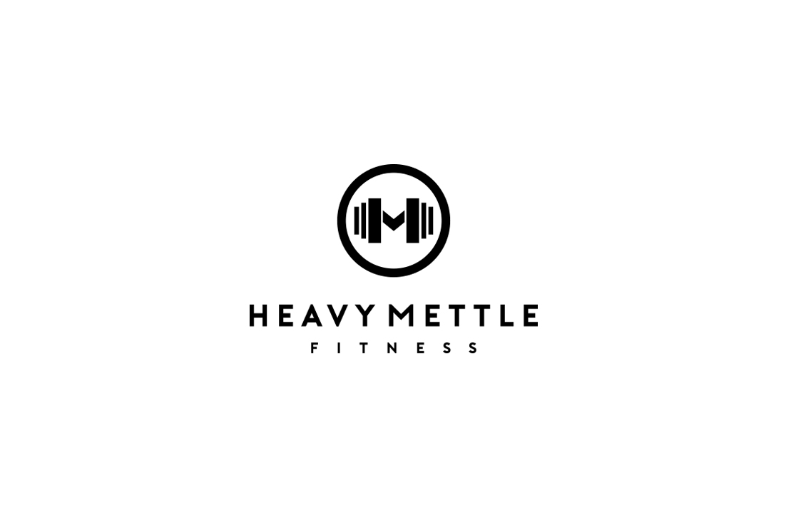
Heavy Mettle Fitness incorporates a clever play on words that makes it stick in your mind. The design keeps things super simple with a paired-back, high-contrast black and white color scheme. The graphic depicts both an ‘M’ to reflect the brand name and also a dumbbell giving it a modern, gym-focused feel.
3. F45
In 2019 F45 found itself in the spotlight when Hollywood superstar Mark Walberg announced he was investing the growing fitness franchise. Such a high profile investment may have been a surprise to some, but to those who attend their intense 45-minute sessions regularly, it wasn’t. The F45 brand is inspired by American college sports such as American football and basketball. This is reflected in their main logo which also describes exactly what they do; functional, 45-minute training.
4. My Fit Products
While My Fit Products is a fitness boutique, the design principles of the logo are spot on, and it would work just as well for a fitness studio. The 2-tone blue and red color scheme catch your eye while the heart and kettlebell graphics communicate health, strength, and vitality. The proportional aesthetic and modern typography complete it by conveying a sense of trustworthiness and balance.
5. Crunch Fitness
In 1998, former stockbroker Doug Levine founded Crunch Fitness. It was popular among young and affluent types in urban centers. Crunch became notable for its unusual class selection, with pole dancing, bicycle-based yoga, and coed wrestling. They were one of the early adopters of selling merchandise at their locations and were quite profitable in this regard. This was due in part to their strong branding and their logo, where the name of the gym is literally being “crunched by a hand.
In Summary
A good logo allows you to communicate more effectively with your customers and potential customers in a personal way. It gives insight into the essence of your fitness business and what you stand for, while also making you instantly recognizable.
While designing an iconic logo isn’t always a walk in the park, by keeping things simple, memorable, timeless, proportional and versatile you’ll make the process easier and more manageable.
So, don’t put it off any longer, get those creative juices flowing, hire a designer or use a logo generator, and start reaping the benefits that a high quality logo can bring to your business.